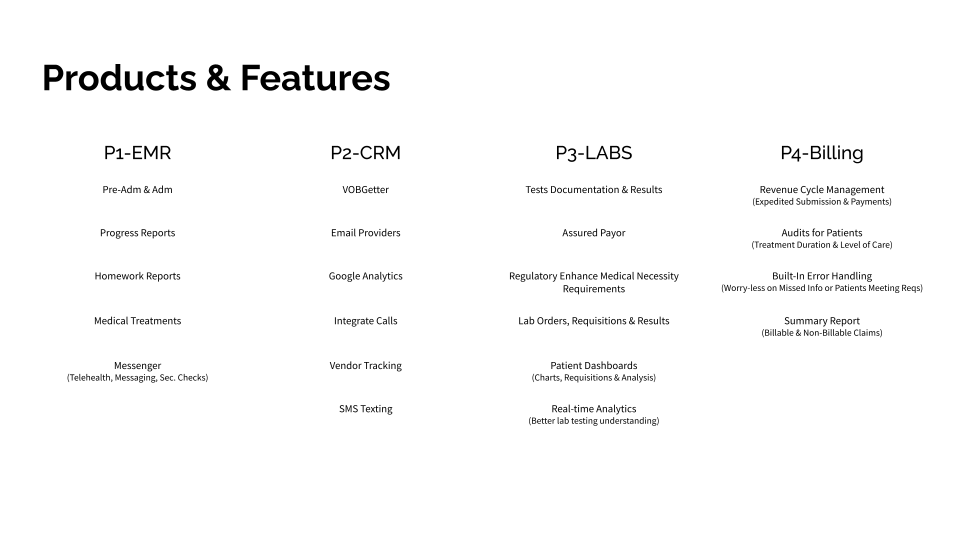
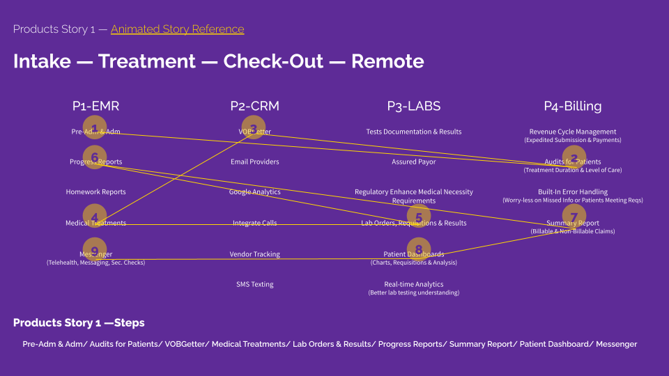
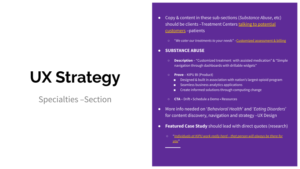
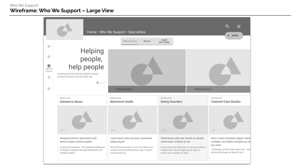
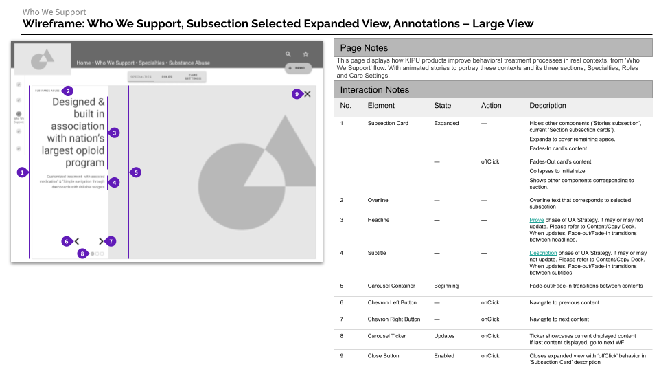
Kipu Health

The project and materials provided in this case were created entirely by me. The previous research materials (links before strategy) were provided by the contractee.

Methodology: Design Sprint

Methods Addressed: Map, Target, Wireframes, Documentation

Tools: G-Drive Suite, Figma

Deliverables: UX Strategy, Sitemap, User-Flow, Desktop & Mobile Wireframes, UX Documentation

If you would like to dig into the research provided by contractee, feel free to request access


Explore the Strategy


Handoff

Desktop/Large

Mobile/Small


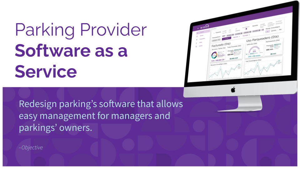
Nidoo Web SaaS • Parking Provider

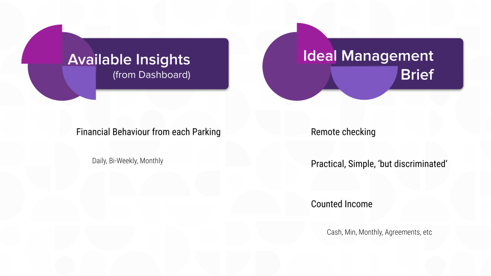
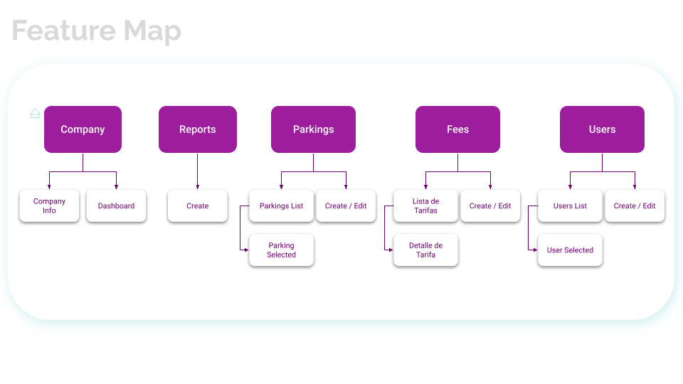
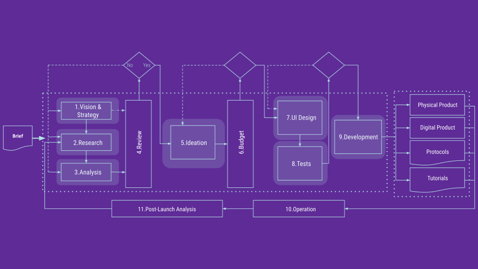
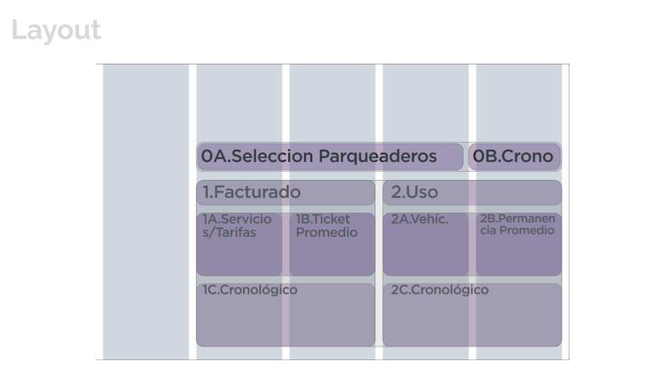
When leading the Product Design team (about 4) in this parking-ecosystem startup, I created, conducted and deliver everything from research to hand-off in this case. Initially the scope was to design the home-screen with a dashboard in mind, but I ended up redesigning the entire platform.

Deliverables: Interviews Analysis, Feature Map, Layout, Design Evaluation, UI Design

Methods: Stakeholder Interviews, Information Architecture, UI Design

Methodology: Design Sprint

Methods Addressed: Ask the Experts - Stakeholder Interviews, Learn through patterns, Map, Sketch, Prototype

Tools: G-Suite, InVision


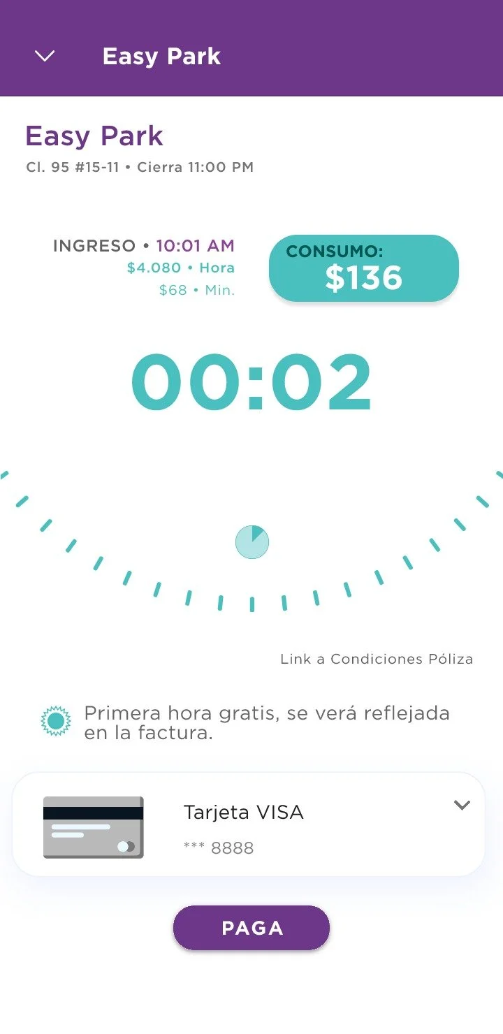
Nidoo On Demand • Parking User

For this project, I led the Product Design team (about 4). The things I created involved, metrics plan and follow-up with dev and implementation, Research Plans, Analysis/ Mapping, Product Architecture (Site-Maps, User-Flows and Wireframes), User Tests, some of the UI (G-Map Skin, Micro-Interactions and Oboarding Lottie Animations)

Methodology: Design Thinking & Human Center Design

Methods: Stakeholder Workshop, Current & Future State Mappings, UX Metrics creation & implementation, Screening Plan, Research Plans, Design System, Micro-Interactions, G-Map Design, Motion Design, Cognitive Walkthroughs (User Tests for Validation), Stakeholder Interviews

Tools: G-Suite, InVision, Draw.io, Google Material Design, Adobe After Effects

Deliverables: UX North Star, UX Metrics, Screening & Research Plans, Research Analysis -Mappings (Current & Future) & Personas, Feature-Maps, User-Flows, Wireframes, Test Plans and Findings, Interview Plans

Nidoo_Mobile_OnDemand_V1 (2).png
 
 
Nidoo_Mobile_OnDemand_V1 (12).gif

Onboarding excerpt screens created with Adobe After Effects, Bodymovin & Lottie


Dondo Barter App

The entirety of this project was done by me. Through a Sprint-like methodology I took the brief given by the client, define a scope, identified assumptions, ideate through How Might We(s), chose a target and design hypothesis, establish success UX metrics from the proposed product, define Design Principles, mapped the Golden Path(s) for both platform roles, sketched and created the User-Flows. With Figma I created the wireframes displayed in this case. I also created a Research Plan for validating the design hypothesis based on the ‘Cognitive Walk-through’ -mediated method.

Brief


Debrief

Artboard 6.png
Artboard 7.png
 

Mapping

Artboard 9.png
Artboard 10.png
Artboard 11.png
Artboard 12.png
Artboard 13.png
Artboard 14.png
Artboard 15.png
Artboard 16.png
Artboard 17.png
Artboard 18.png
 

Sketching

Artboard 20.png
 

Userflows

Artboard 22.png
Artboard 23.png
 

Wireframes


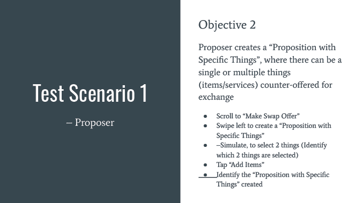
User Testing Plan

Cognitive Walkthroughs

Artboard 27.png
Artboard 28.png
Artboard 29.png
Artboard 30.png
Artboard 31.png
Artboard 32.png
 

App Consejero Financiero

I was solely involved in the deliverables presented in this project. The closest methodology I aligned with is Design Sprints, were I de-briefed the given requirement through the 4 Jobs To Be Done provided and redesigned a financial advisor app. There was an initial app-evaluation, domain research, design hypotheses, Golden Path, Product Information Architecture and Mid-Fidelity screen-designs. The Mid-fidelity wireframes were delivered through Figma and Google’s Material Design system.

Brief

Artboard 4.png

Debrief

Artboard 6.png

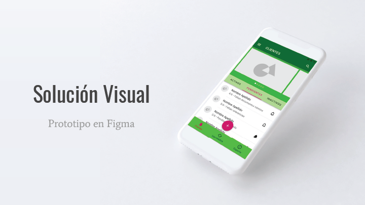
Entregable 1 — Solución Visual del Home

Entregable 2 — ¿Cómo se llegó a la solución visual?

Entregable 3 — Justificación del Proceso de Diseño

Diagnóstico Inicial – Evaluación de Principios Interactivos

Diagnóstico Inicial — Revisión Tecnológica

Hipótesis de UX

Mapeo

Arquitectura de Información

Financial Advisor App

Quick and dirty half a day exercise where I created everything. Through a very sprinted methodology I scoped the specific brief with the User Stories provided and translated these into a Golden Path (Future-State Map), a quick Feateure-Map and some Mid-Fidelity Wireframes.

Debrief

Objective:

“[C]reate an experience where advisors on our platform can log in to review and communicate with their clients.

Task: Advisor logs in, reviews a client and communicates with her/him

  1. Login

  2. Select Client, aggregate list view

  3. Browse Individual client view

    1. Info

    2. Call

    3. Message


Value Proposition

A platform that allows –advisors, keep track of current business and new  business (UpWork/Fiver), where they can communicate and collaborate / CRM –keep track of client journey (phase1, p2, etc)

What are we solving?

Easily create, track, contact, record, schedule and conduct a financial relationship with clients. Grow the business while delivering a great experience.

User Scenario

  • Advisor typically between age 30-50Paper/ Handwriting

  • Paper/Handwriting

  • Call / Email

  • Spreadsheets

  • Don’t know there are better possibilities

  • “Easier, faster & works”

  • Responsibilities: discovery for potential clients (gather information/ match and assigning profile with servicing tools/ communicating with client)

  • Help people (Altruistic, curious)

  • Not most tech savvy –Less is more


What does an advisor typically

  1. Says: What’s next (step, heard from…, why or not moving forward, followup)

  2. Thinks: Don’t know there are better possibilities

  3. Does: Tracking different things/ Looking towards how to help

  4. Feels: They feel they don’t have enough time/ They are doing enough/ Opportunities to hone into for follow-up questions

Best practices of advisor-client communication

  1. What are the most recurrent actions?

    1. Milestones on the process revolve around meetings

      1. Before and after (planning, what to cover, reports, follow-up questions)

  2. Which pain-points should we tackle?

    1. Breaking down miscommunication

      1. Missing/Late to next meeting

    2. Not knowing digital lingo/language

We should design for: Phone and text communication

  • Preferably iOS, iPhone X and beyond


Golden Path –Key Steps to reach Value Proposition

Golden Path.png

User Stories

  • As an advisor I want to easily log-in so that I can Skim & Scan clients list

  • As an advisor I want to immediately identify what is my next appointment so that I can either call or message the client

  • As an advisor I want to easily view which are my follow-up clients so that I can keep in touch through email or phone

  • As an advisor I need to record client’s general info (Name, financial goals, key facts) so that I can manage my client’s relationship successfully

  • As an advisor I need to track my client’s financial history with its corresponding financial goals so I can successfully advise my client

    • As an advisor I need to write notes whenever I am meeting my clients so that I can successfully track my client’s financial history

  • As an advisor I want to access my client’s contact info (phone and email) so I can easily reach them

  • [Reschedule]As an advisor I want to be able to reschedule so that any unexpected events can be properly handled

Design Hypothesis

  1. Quick and easy log-in with email or Google/Apple

  2. 3 tabs to organize clients (Day-to-day, Alphabetically, Per Phase)

  3. A ‘Client View’ should quickly communicate the financial plan and performance so far with a graph

    1. A plan can be divided into milestones

    2. Each milestone should have leads, budget and actions


Mid-Fidelity Design

Retirement Plans Bank Feature

Tools: G-Slides, G-MD Color Tool, Figma

Deliverables: UX Research & Analysis, Information Architecture, Wireframes, UI Design & Prototype

Methods: Challenge, User Research -Online, Competitive Research & Analysis, Design Hypothesis, Information Architecture (Tasks, User-Flow), Wireframes, UI Design.

 
First screen from the Figma Prototype

First screen from the Figma Prototype

Debrief

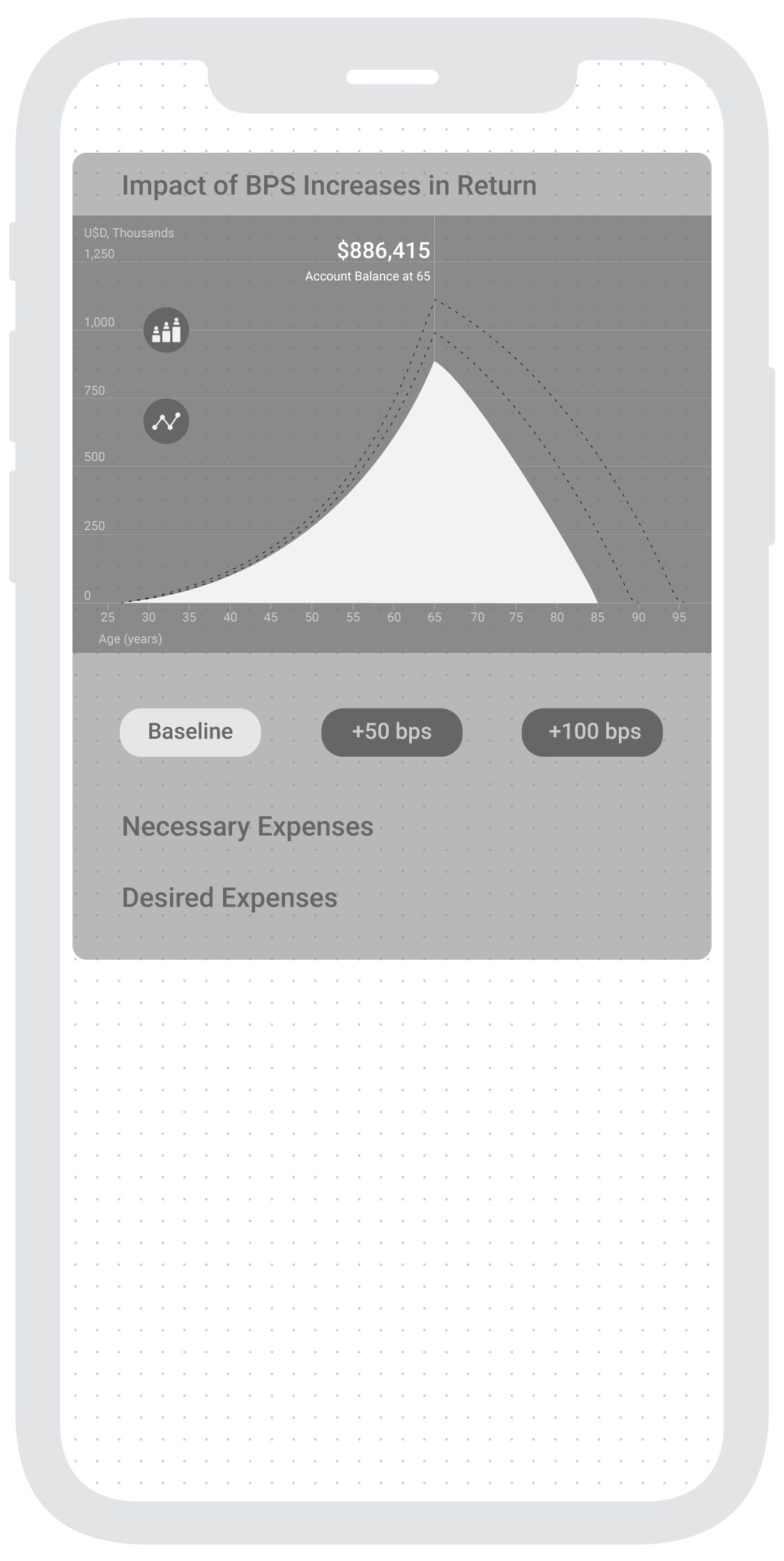
For a successful job opportunity test, I was asked to visually communicate the dramatic outcomes that can result from slight changes in BPS (Basis Points) –retirement plans, in an attractive intuitive and immediate way. This is what I came up within the 48 hour timespan. If you want to skip to the Figma Prototype.

Objective

Create a product that easily communicates the vast difference in results when there are slight changes in BPS for retirement plans.

UX Strategy

Stakeholder’s Desire 

Our app should convey immediateness, attractiveness and intuitiveness .

UX Design Hypothesis 

Communicate how these dramatic outcomes translate into their lives.

Key Question: What do people care about/value when choosing retirement plans?

Investopedia

One of the most challenging aspects of creating a comprehensive retirement plan is striking a balance between realistic return expectations and a desired standard of living. The best solution is to focus on creating a flexible portfolio that can be updated regularly to reflect changing market conditions and retirement objectives.

3 Things Most Americans Want In Retirement And How To Get Them, Forbes

“First, people want to experience freedom from financial worries in retirement. This should not come as a surprise as 95 percent of respondents stated that freedom from financial concern is important to their definition of success in retirement.[...] 

Second, Americans want flexibility in retirement. Almost all respondents, 96 percent, stated that having the flexibility to do what they want in retirement is an important component to their definition of a successful retirement.[...]

Third, retirees want to spend time with family, to relax and travel as part of a secure retirement. For instance, 93 percent of the survey respondents stated that spending time with family was important for a successful retirement, 92 percent stated that relaxing was an important factor, and 80 percent stated that having the time to travel was crucial to a successful retirement plan.”


Competitive Research (Click here for more)

The Best Retirement-Planning Apps” by Kate Anania, Investopedia, Dec./19

Findings

  • “Acorns” Potential’ interactive simulation visually communicates simplicity, intuitiveness, attractiveness and potential impact in real-time

    1. With a vertical slidable graph selector, people can determine the time at which the simulation sets the ‘Hypothetical Projection’ in terms of the user’s age

    2. You can set another ‘Hypothetical Projection’ by selecting the “Change Your Potential” Button at the bottom

      1. Another graph emerges and results are shown comparatively, ‘Recurrent Periodic Investment’ and ‘Current

      2. People can choose an amount of set money values (intervals of $5 & $10) and the periodicity of such amount (Day, Week, Month)

      3. CTA "Turn on" button to activate “Recurrent Investment” feature, becomes very persuasive as you can perceive in real-time the vast difference from a small change

 
  • Mint” harnesses integrations with financial products and presents them in a way that is useful and insightful from a daily and planning perspective

    1. Simple UI with readable dashboards to have both a general understanding and details around spending and financial goals

    2. Extensive “Budgeting” categories 19 (75 subcategories)

  • Retirement Planner” Straightforward app with informative fields to have in mind

    1.  Ranked #1 in Investopedia, despite its poor Intuitiveness, Feedback and Visual Impact


Data Interpretation –from provided graph

  1. Visually the difference between the 3 BPS outcomes are not perceived as “dramatically different”

  2. Within an interactive environment such as mobile app, there's an opportunity where Data could be splitted, hidden and zoomed

    1. Setting “Demographic Assumptions” with defaulted values and embed them in an interactive component like a “collapsible list

    2. Scenario Assumptions” are the core of the simulation, so the three BPS buttons should always be visible

    3. Impact BPS Increase” give a general sense that withdrawal extends over time, but lacks meaningful possibilities for spending in hypothetical scenarios

  3. Why are “Annual Withdrawal Amount”(s) and “Withdrawal %” the same regardless of BPS?

    1. Assumption: The annual withdrawal amount is extended over more years

      1. What if people would rather spend more over less years? 

        1. What kind of expenses are relevant (amounts and timespan)?

  4. Are the years before retiring relevant when deciding a Retirement Plan?

    1. Assumption: Since its a static data representation, it can’t change view

      1. What if a closer “Retirement View” was presented? 

  5. Vital Info

    1. Account Balance at Retirement Age

    2. Annual Withdrawal Amount

    3. Other info can be shown when selecting corresponding item


Information Architecture

What is(are) the necessary feature(s) to accomplish the objective?

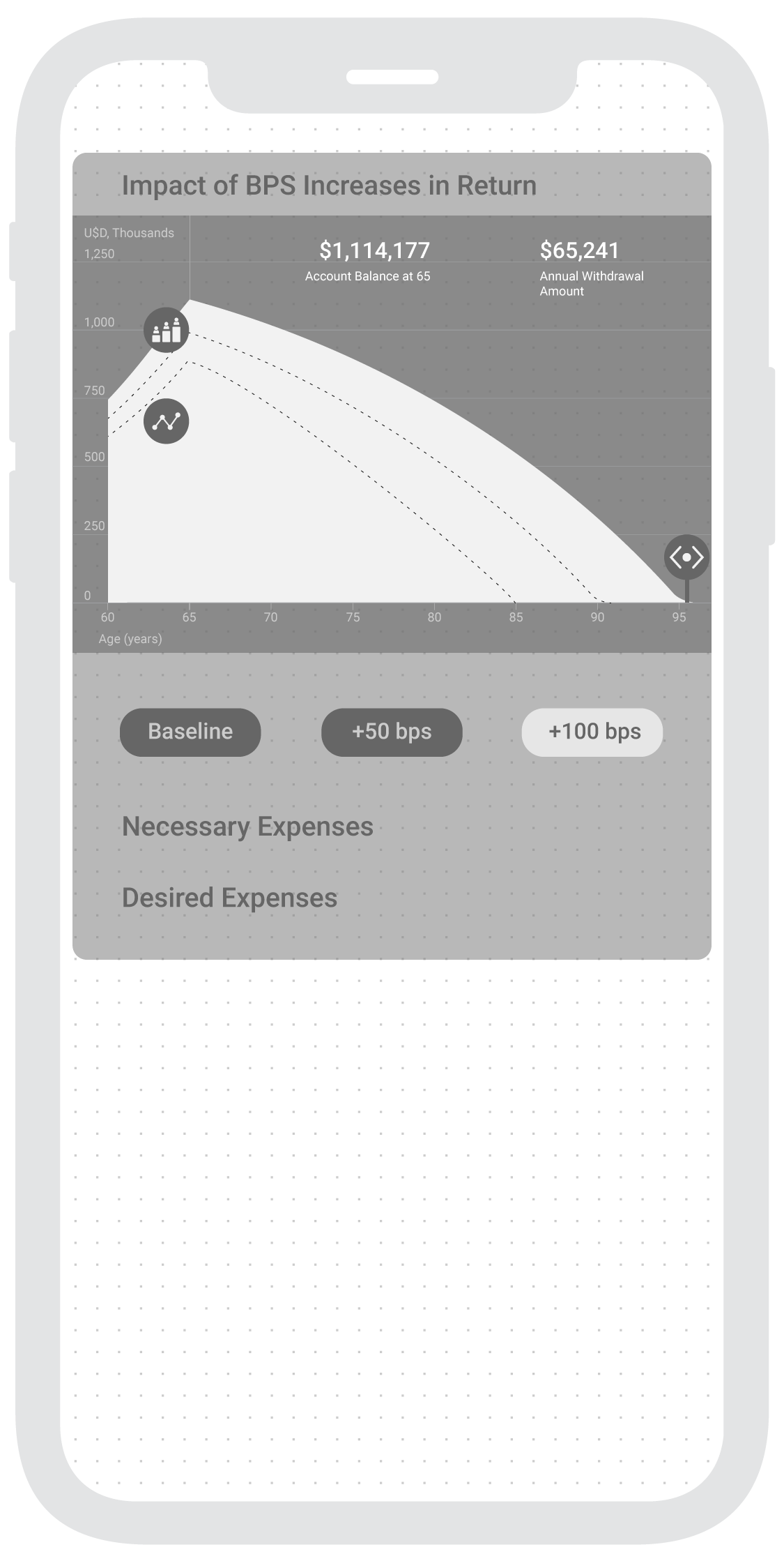
  1. Interactively visualize the dramatic difference in outcomes that can result from slight changes in BPS.

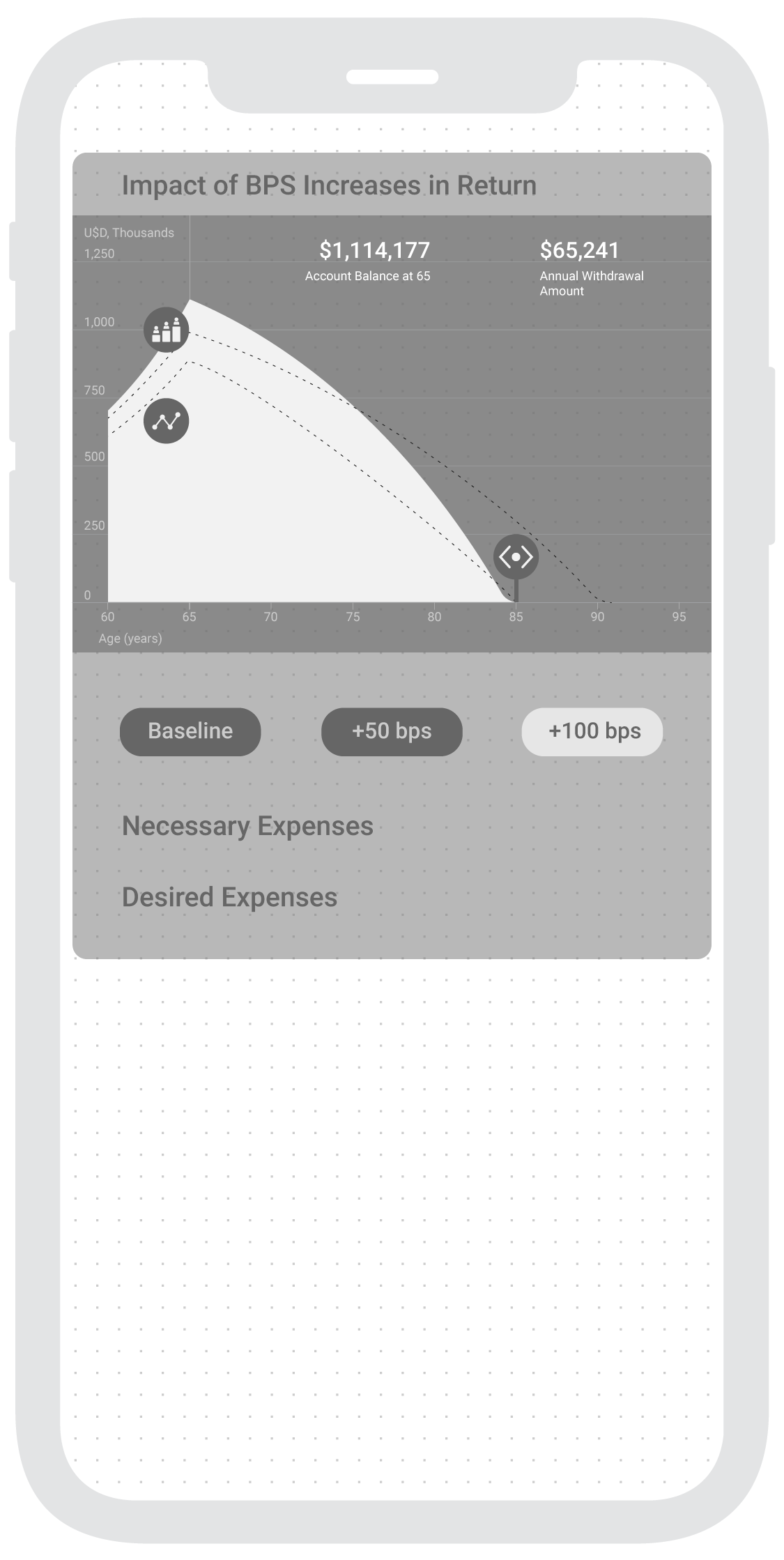
  2. Create a more dramatic view in the graph by zooming the X-Axis of Age. This will translate visually into a greater difference.

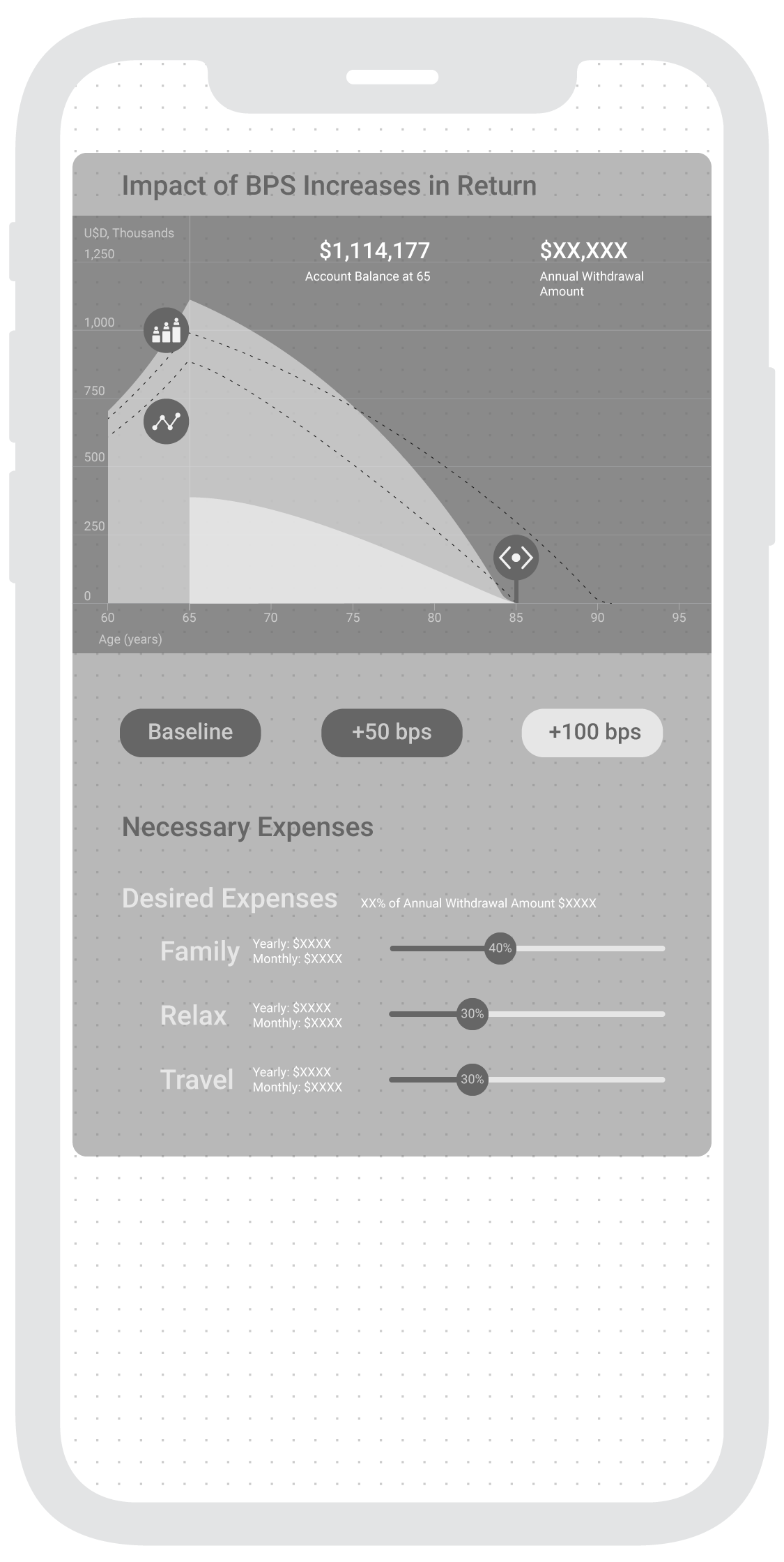
  3. Similarly, communicating how could these changes translate into meaningful retirement scenarios such as more available spending on family visits per year or month.


Outline

3. Relevant Expenses Section Shown in BPS Increases Graph when selected

  • Necessary (Yearly, Monthly, Weekly) [Fixed and correspond to selected General BPS value of Age]

    • Food

    • Health

    • Home

    • Bills & Utilities

    • Transport

    • Taxes & Fees

  • Desired (Yearly, Monthly, Weekly) [Slidable in Age, X-Axis]

    • Family

    • Relax

      Travel

  1. Intro Screen (Demographic Assumptions)

    • Starting Balance: $0

    • Starting Age: 30

    • Starting Salary: $40,000

    • Retirement Age: 65

  2. Impact of BPS Increases Graph

    • Account Balance at Retirement Age 65” (Visible when selecting type of BPS, default “Baseline")

    • Annual Withdrawal Amount” (Updates according to interactions)

    • Select BPS (Zoom to range from “Retirement Age” to “Life Expectancy”)

      • Account Balance at Retirement Age updates

    • Slide value -horizontal axis to choose a spending “Withdrawal Scenario Age” deadline in selected BPS (“Annual Withdrawal Amount” updates)


Wireframes

I have decided to take a mobile first approach, meaning the mobile app interaction will start from a phone layout since it is more widely used than tablets.

User Flow

2.WANDR_ABCcapital.jpg
 

Assumptions

I’ve decided to choose Mexico’s Bank “ABC Capital” since the American ABC Capital is a real estate company and the other ABC Capital is a Chinese Venture Capital whose website is in chinese.


Interface Design

I implemented Google’s Design Material since it presents a mobile OS agnostic approach for development.

Color

Screen Shot 2020-06-12 at 9.31.42 AM.png

ABC Capital’s brand colors include Blue (#00457D) and Red (#E62C38).

Using Material Design’s Color Tool as the starting point for managing color alternatives.

Both primary colors showcase a vibrant result when they are combined (low readability). This is why, following some color theory, I have composed three alternatives around the blue spectrum, with the primary brand’s color and the two variants created with this tool. 


Color Variations

Screen Shot 2020-06-12 at 9.45.25 AM.png
 

Figma Prototype

In this link.


Remake App Ideas

Call for Interaction Concept

Having different sources to a place where creatives channel their creative blockage and funnel their frustration through a playful way of tentative sustainable ideas has come to: three types of interactions and a pre-screen that sets the turning-point towards fun. 

The first screen is a feed of memes about creative block. A good way of setting perspective is through tragic comedy

Ideation Elements to Remix

Images are separated in three categories. The first is an unclaimed or abandoned object, the second is a highly sustainable material and the third a remake design. Whenever shuffling a new remix, the idea is to also create phrases. This phrase should include terms like as upcycle, reconfigure, renewable, inclusive, composting, durable and modular.


Interaction 1: Spinning

Interaction 2: Flipping

Interaction 3: Tapping

Ideation Tool – Redesign & Interactive Prototype

Previous Iteration


Call for Interaction

Having in mind Mobile Devices peripherals, I set onto creating a more playful interaction. An interaction from the intersection between common gestures in the real world and Mobile Phone's accelerometer.

I've borrowed two playful gestures from daily observations the reflexive spinning and the swift juggling. Two gestures that could be technically feasible and experientially engaging.

UI Redesign

I've decided to simplify the interface towards the new experience. The accelerometer remixes the images, and a tap shows the prompt from a generated text. This text is a computational mix from the description of the objects shown on screen. This way, people can be inspired visually and textually.

Interactive Prototype

The interactive prototype was made in Javascript using Cooper Hewitt Museum's API, a RiTa a toolkit for computational literature and the p5js library. This is where the Interactive Prototype can be experienced.

Through Javascript, I'm retrieving all the data from the Cooper Hewitt Museum including images and text from their online exhibition data base. I clean the information and select a topic, in this case, all objects in the museum related to 3D Printing

Gestures

Turns out the spinning gesture is one of the blind spots in Phone Accelerometers. This is why, the prototype will only respond to juggling-type gestures

Text Prompt

By retrieving the descriptions from the 3 objects shown in the screen, I create one phrase by remixing the tokens through a set of computational procedures. Every time the images shown change the tokens by which the phrases are created change. 

Even though the prompted phrases have grammatical errors, embracing the computational glitchiness aligns with the overall playful and mind diverting concept of overcoming a creative block.

Solar Data Logger

Concept

What could be a way to log ITP's entrance and see the difference between the elevators' use and the stairs'? Through a solar powered DIY Arduino, we decided to visualize this data (and store it in a .csv table) in the screen between the elevators at ITP's entrance.

Development

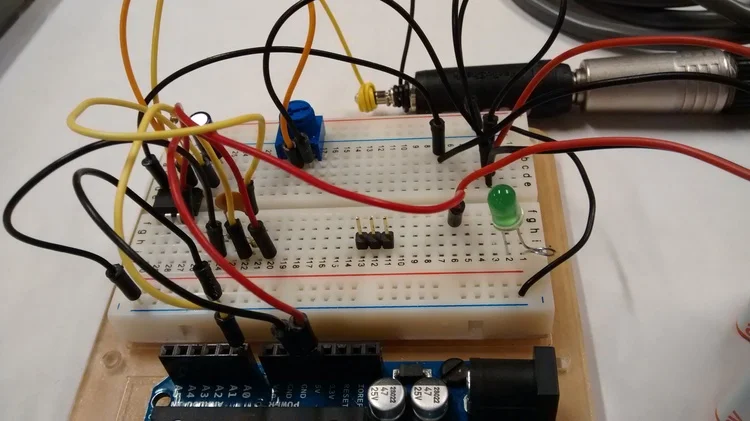
After creating a DIY Arduino that could be powered through solar energy, by following Kina's tutorial we were able to set a basic solar rig that would charge the 3.7V and 1200 mA LiPo battery. We connected the solar panels in series and ended up with an open circuit voltage of 13V. Our current readings however, were of 4 mA.

We hooked the Arduino data to a Processing sketch that would overwrite the table data of a .csv file every second. All of the code can be found in this link.

M-Code Box

Concept

How can a fabricated object have an interactive life? The M-Code Box is a manifestation of words translated into a tangible morse code percussion. You can find the code here and what's needed to create one M-Code Box is an Arduino UNO, a Solenoid Motor (external power source, simple circuit) and a laptop with Processing.

Next Steps

There are two paths to take this project further. One is to have an interpreter component, recording its sounds and re-encoding them into words, like conversation triggers. The second is to start thinking on musical compositions by multiplying and varying this box in materials and dimensions.


Previous Iterations

This project came upon assembling two previous projects, the Box Fab exploration of live hinges and the Morse Code Translator that translates typed text into physical pulses.

Ideation Tool from Cooper Hewitt Museum API

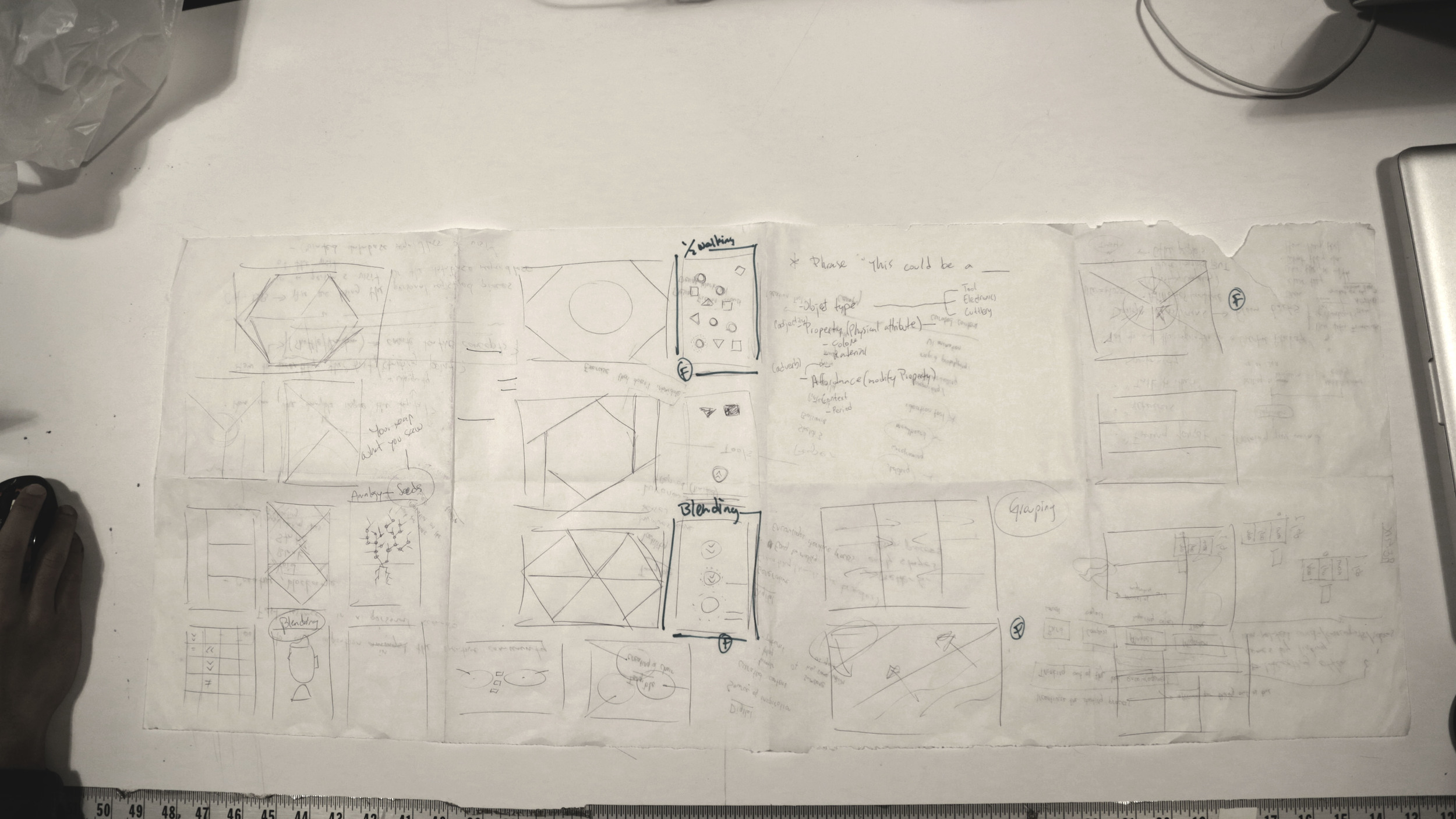
This project is an ongoing pursue around the question of how to overcome a creative block? Partnered with Lutfiadi Rahmanto, we started out scribbling, sketching and describing the problem to better understand what it meant for each of us and how do we scope this problem and usually respond to it.

UX Research

From the first session we were able to narrow the idea onto a determined goal: A tool to aid inspiration in the creative process. This led us to consider various things around the sought scenario and allowed us to start asking other creatives around this. We sought to better understand –qualitatively– how creatives describe a creative block and more importantly how is creative block overcome? From this session we were also able to reflect on how to aid that starting point of ideating, often a hard endeavor. A resonating answer in the end, was through linking non-related words, concepts or ideas.

We also researched two articles with subject matter experts about Creative Block and Overcoming It ("How to Break Through Your Creative Block: Strategies from 90 of Today's Most Exciting Creators" and "Advice from Artists on Hot to Overcome Creative Block, Handle Criticism, and Nurture Your Sense of Self-Worth"). Here we found a collage between our initial hypothesis with additional components such as remix, from Jessica Hagy's wonderful analogical method of overcoming her creative block by randomly grabbing a book and opening it a random page and linking "the seed of a thousand stories". Another valuable insight was creating space of diverted focus from the task at hand generating the block. We also found a clear experience-design directive for our app, to balance between constrain –structured scrambled data from the API– and freedom –imaginative play–.

Brief, Personas and Scenarios

After validating our intuitive hypotheses on how to address the problem through the contextual inquiries and online articles we came up with a solid Design Brief:

Encourage  a diverted focus where people are able to create ideas by scrambling data from the Cooper Hewitt's database into random ideas (phrases). 

Through this research we created seven different behavior patterns and mapped them onto this two-axis map, that defines the extent to which personas would behave between casual/serious and unique/remix

For a more detailed description of these archetype behaviors visit this link

This enabled us to create our guiding design path through what Lola Bates-Campbell describes as the MUSE. An outlier persona to direct and answer the usual nuances behind designing, in this case, our mobile application tool to aid Mae Cherson in her creative block. We determined her goals and thus her underlying motivations, what she usually does –activities– during her creative environment and how she goes around between small and greater creative blocks in her working space. We also describe her attitudes towards this blocking scenario and how her feelings entangle whenever seeking for inspiration. There were some other traits  determined as well that can be reach in more detail through this link.  Overall we crafted this Muse as a reference point for creating an inspirational experience for the selected archetypes –The Clumsy Reliever and The Medley Maker–.

Engagement

Parallel to the archetypes mapping, we began thinking how to engage our audience –Artists, Designers, Writers, Thinkers, Makers, Tinkerers, all poiesis casters–. Soon we realize the opportunity of captivating our audience through a game-like interaction. A gameplay that requires simple gestures and encourages discoverability. Some of the games we took as reference are Candy Crush and 2 Dots. Two simple games that have out-stand for their heavily and widespread engagement.

Wireframe Sketches

By having research cues and possible game-like affordances in mind there's proliferous space to weave tentative design solutions. Hence we made a couple whiles to sketch layouts, concepts, poetic interactions and nonsense infractions.

On the other side we created sense and sought a balance between amusement and feasibility. At the end of this session we came up with three Design Layout Concepts and general Affordances (call to interaction): Linking, Discovering and Dragging.

Test Insight

From these concepts we started making interactive prototypes. While creating the Discovering prototype, we realize people's intuitive mental model beneath a Candy Crush-like interaction did not match with our design intent, and trying to match it resulted overly complicated and forced. This is why we created prototypes for the Linking and Dragging concepts.

Prototypes

Another prototype explores the underlying preference between text-driven inspiration and visually-driven inspiration. While testing these prototypes we realize some people tent to feel more inspired by imaging the words from a text, and other people feel more inspired by visual queues. This prototype allows both explorations.

The next step is to select one gameplay interaction from our user tests and sintactically address the text data from the API. 


This is another interaction mode –Remixing Mode–, thought after Katherine's valuable feedback on our final prototype that can be accessed in this link.

Airplane Food Order

The ideal experience behind an order in a plane –maybe elsewhere as well– would be to be suggested food pairing by correlating the person's Agenda, Rest Prediction through Biometric sensed data, and a Medical history. Before creating the wireframe, I deconstructed the information into a Hierarchical Task Analysis to have a better sense of the drill down flow of the overall UI

There's 3 sub-levels involved in the order flow, except for Coffee which takes two additional (type of milk and sweetness). By creating this, I was able to decide on micro interactions such as reducing the choices to Yes or No answers whenever a refined choice is needed. For instance,  Water with or without ice. This allows for an overall consistent UI flow.

The overall circle layout is the a tentative proposal towards cyclic rituals behind meals.

Health Applications –Pain Tracking–

We chose two mobile applications that ideally will help patients collect meaningful information about their symptoms and share them with their doctors in way that they can emit better recommendations. Thus, we looked at three overall assets in the applications: first that the use of these apps don't generate an additional frustration over their health, second that what they are registering can be is easily inputed and third that what's being registered could be useful for the doctor. After some research in the abundant alternatives of applications, we chose RheumaTrack and Pain Coach, even though we discarded Track React and Catch My Pain. Overall, we sought the best ones to ultimately decide which of the two was better. Its fair to say that both have useful and usable affordances, but RheumaTrack does add aggregate value that Pain Coach doesn't. 

Overall we realized RheumaTrack is a better application because of one particular service or function, which is the way people input their joint pain. This interface in a nutshell is a meaningful (useful & usable) way for both patient and doctor of visualize and recording the pain condition in a really predictable manner. The overall process of adding a new entry (pain, medication and activity), though a bit clamped is clearer than others and pretty straightforward. This dashboard follows the conventional standards in regards of Mobile GUI design, where items and affordances are perceivable (easily readable) and predictable, and the overall navigation feedback. I could realize two simple UX elements that this could improve, which is whenever adding a "New Check" there's no progress bar to predict how long is this task going to take. The "Activity" interface could visually improve in various points . First, generating better contrast between the data recorded and the layers of pain intensity to enhance perceivability (readability) and the tags' date-format can be confusing. Nevertheless, the overall purpose of the "Activity" service or function is very useful for doctors.
Mind the Needle — Popping Balloons with Your Mind 0.2


Concept

Time's running out! Will your Concentration drive the Needle fast enough? Through the EEG consumer electronic Mindwave, visualize how your concentration level drives the speed of the Needle's arm and pops the balloon, maybe!

Second UI Exploration

Second UI Exploration

Development & UI

I designedcoded and fabricated the entire experience as an excuse to explore how people approach interfaces for the first time and imagine how things could or should be used.

The current UI focuses on the experience's challenge: 5 seconds to pop the balloon. The previous UI focused more on visually communicating the concentration signal (from now on called ATTENTION SIGNAL)

This is why there's prominence on the timer's dimension, location and color. The timer is bigger than the Attention signal and The Needle's digital representation. In addition this is why the timer is positioned at the left so people will read it first. Even though Attention signal is visually represented the concurrent question that emerged in NYC Media Lab's "The Future of Interfaces" and ITP's "Winter Show" was: what should I think of? 

Showcase

Insights

What drives the needle is the intensity of the concentration or overall electrical brain activity, which can be achieved through different ways, such as solving basic math problems for example –a recurrent successful on-site exercise–. More importantly, this question might be pointing to an underlying lack of feedback from the physical devise itself, a more revealing question would be: How could feedback in  BCIs be better? Another reflection upon this interactive experience was, what would happen if this playful challenge was addressed differently by moving The Needle only when exceeding a certain Attention threshold?

Previous Iterations

Panic App

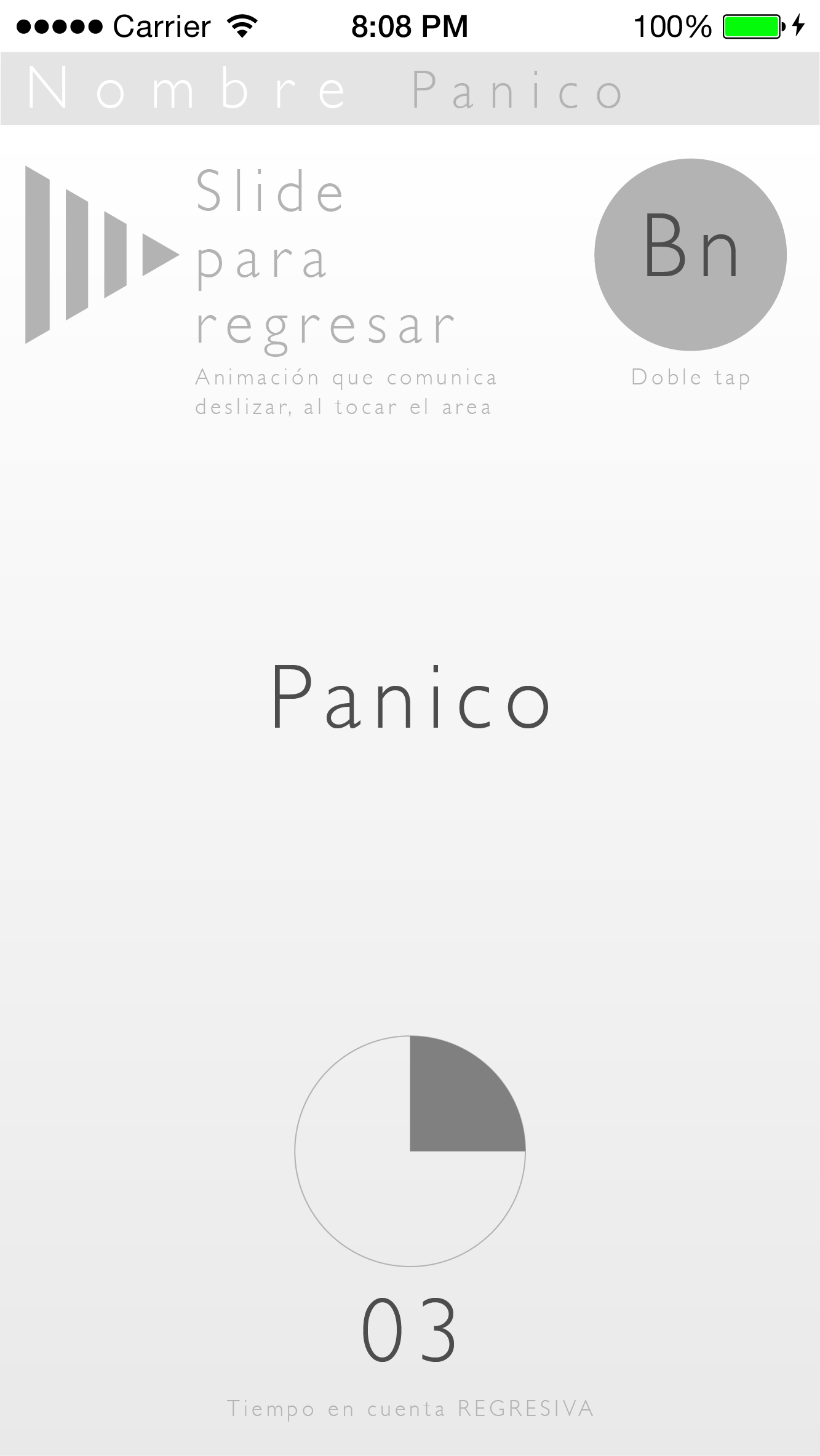
By the end of 2014, crime rate -deaths- in Bogota, Colombia decreased. Mugs however remained, and to tackle the common smartphones theft, in Pinedot Studios we attempted to solve it. We created this concept app and pitched it to INTEL Colombia.

Wireframe

Mockup

Palindrome Hour Web-Clock

This is a project that celebrates hours that can be read either from left-to-right and right-to-left, same as palindrome text –flee to me, remote elf–. A concept of living symmetry overlaid with pleasing coincidence, and chunks of daily serendipity. 

 I designed & coded this project in Javascript with the creative toolkit p5.js. Hop in, and catch the palindrome hours! Link To Project Here

Previous Iteration

UI Drafts

Generative Soundscape Concept

When studying Interactive Technologies at NYU’s Interactive Telecommunications Program, I was working towards an interactive installation that blended the bowling gesture to trigger scattered half-spheres to generate a musical experience. This is an evolved and collaborative idea, from the Generative Sculptural Synth. The ideal concept is an interactive synthesizer that's made up of replicated modules that generate sound. It is triggered by sphere that creates chain-reaction throughout the installation's configuration.


Methodology: Iterative Concept and Prototyping

Tools: Arduino and Little Bits

Deliverables: Prototype of a modules that communicate and trigger through motion and sound range

It started out as re-configurable soundscape and evolve into an interactive –bocce-like– generative instrument. Here's a inside scoop of the brainstorming session were we –with my teammate– sought common ground. (1. Roy's ideal pursuit 2.My ideal pursuit 3.Converged ideal)

Audio Input Instructable

It started out as re-configurable soundscape and evolve into an interactive –bocce-like– generative instrument. Here's a inside scoop of the brainstorming session were we –with my teammate– sought common ground. (1. Roy's ideal pursuit 2.My ideal pursuit 3.Converged ideal)

Littlebits –whatever works–

After the slum dunk failure of the DIY Audio Input, I realize the convenience –limited– of prototyping with Littlebits. This way, I could start concentrating in the trigger event, rather than getting stuck at circuit sketching. I was able to program a simple timer for module to "hear" –boolean triggered by the microphone– and a timer for the module to "speak" –boolean to generate a tone–. What I learnt about the limitations of the Littlebit sensor is a twofold. They have a Sound Trigger and a conventional Microphone. Both bits' circuits have the embedded circuit solved out which turned out to be useful but limiting. The Sound Trigger has an adjustable Gain, an embedded –uncontrollable– 2 second timer and a pseudo-boolean output signal. So even though you can adjust it's sensibility, you can't actually work around with its values in Arduino IDE. The Microphone bit had an offsetted (±515 serial value) but its gain was rather insensible.

This is why, when conveniently using the Sound Triggers, the pitch is proportional to the distance. In other words, the modules are triggered closer when lower pitches are sensed and vice versa. However, since these bits –Sound Trigger– are pseudo-boolean, there can't be a Frequency Analysis.

Mind the Needle Iteration 0.1

First Iteration of Mind the Needle, an exploration of emergent interfaces.

Mind the Needle is project exploring the commercially emergent user interfaces of EEG devices. After establishing the goal as popping a balloon with your mind –mapping the attention signal to a servo with an arm that holds a needle–, the project focused on better understanding how people approach these new interfaces and how can we start creating better practices around BCIs –Brain Computer Interfaces–. Mind the Needle has come to fruition after considering different scenarios. It focuses on finding the best way communicating progression through the attention signal. In the end we decided to only portray forward movement even though the attention signal varies constantly. In other words, the amount of Attention only affects the speed of the arm moving, not its actual position. Again, this is why the arm can only move forward, to better communicate progression in such intangible, rather ambiguous interactions –such as Brain Wave Signals–, which in the end mitigate frustration.

The first chosen layout was two arcs the same size, splitting the screen in two. The arc on the left is the user's Attention feedback and the other arc is the digital representation of the arm.

After the first draft, and a couple of feedback from people experimenting with just the Graphical User Interface, it was clear the need for the entire setup. However, after some first tryouts with the servo, there were really important insights around the GUI. Even though the visual language –Perceptual Aesthetic– used did convey progression and forwardness, the signs behind it remained unclear. People were still expecting the servo to move accordingly with the Attention signal. This is why in the final GUI this signal resembles a velocimeter.

UI Alternatives

Physical Prototype

Sidenote: To ensure the successful popping-strike at the end, the servo should make a quick slash in the end (if θ ≧ 180º) – {θ = 170º; delay(10); θ = 178;}

Morse Code Translator

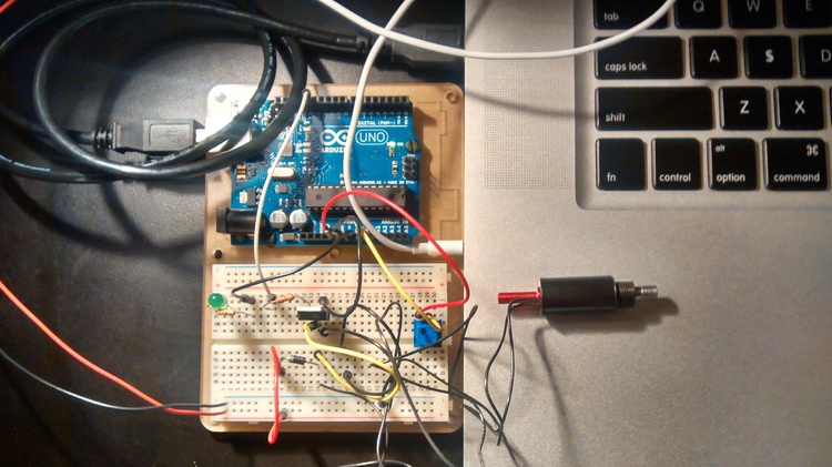
Inspired by the "Hi Juno" project, I sought an easier way to use Morse Code. This is why I've created the Morse Code Translator, a program that translates your text input into "morsed" physical pulses. One idea to explore further could be thinking how would words express physically perceivable (sound, light, taste?, color?, Tº)

So far I've successfully made the serial communication and the Arduino's functionality. In other words, the idea works up to Arduino's embedded LED (pin 13). This is how a HI looks being translated into light.


Followup, making the solenoid work through morse coded pulses. You can find the Processing and Arduino code in this Github Repo.