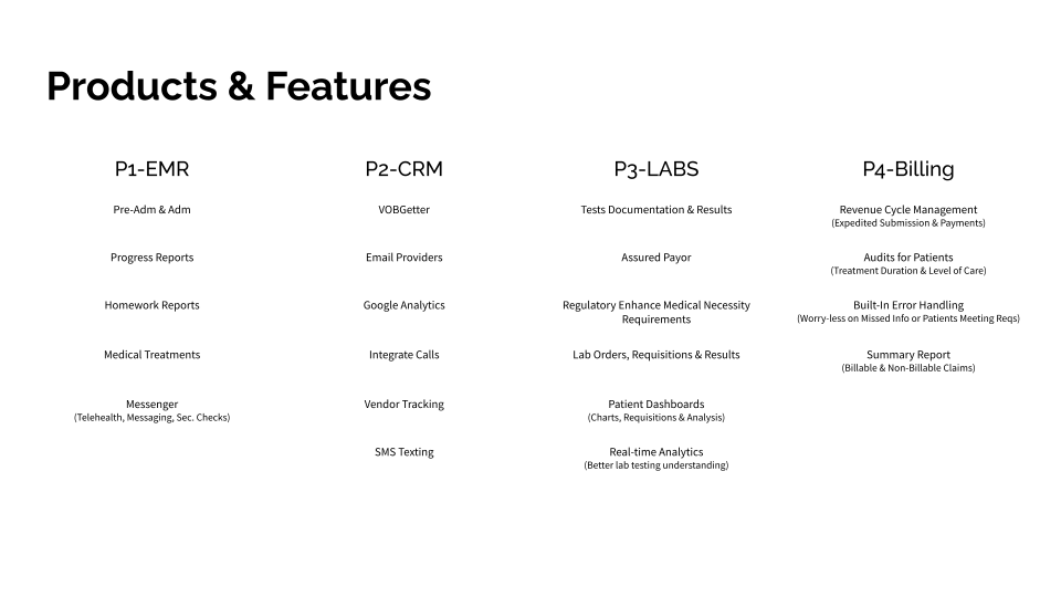
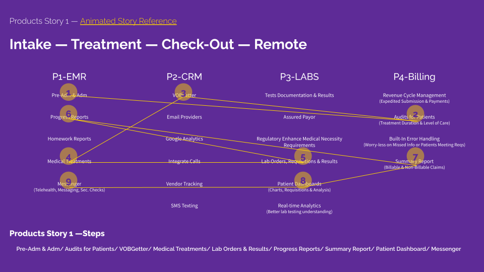
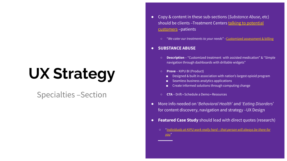
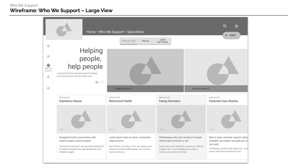
Kipu Health

The project and materials provided in this case were created entirely by me. The previous research materials (links before strategy) were provided by the contractee.
Methodology: Design Sprint

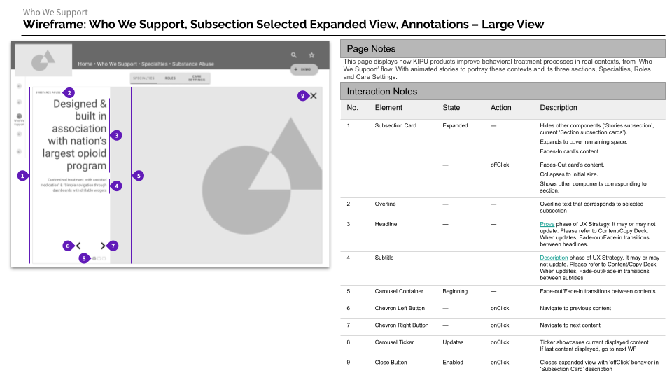
Methods Addressed: Map, Target, Wireframes, Documentation

Tools: G-Drive Suite, Figma

Deliverables: UX Strategy, Sitemap, User-Flow, Desktop & Mobile Wireframes, UX Documentation

If you would like to dig into the research provided by contractee, feel free to request access


Explore the Strategy


Handoff

Desktop/Large

Mobile/Small


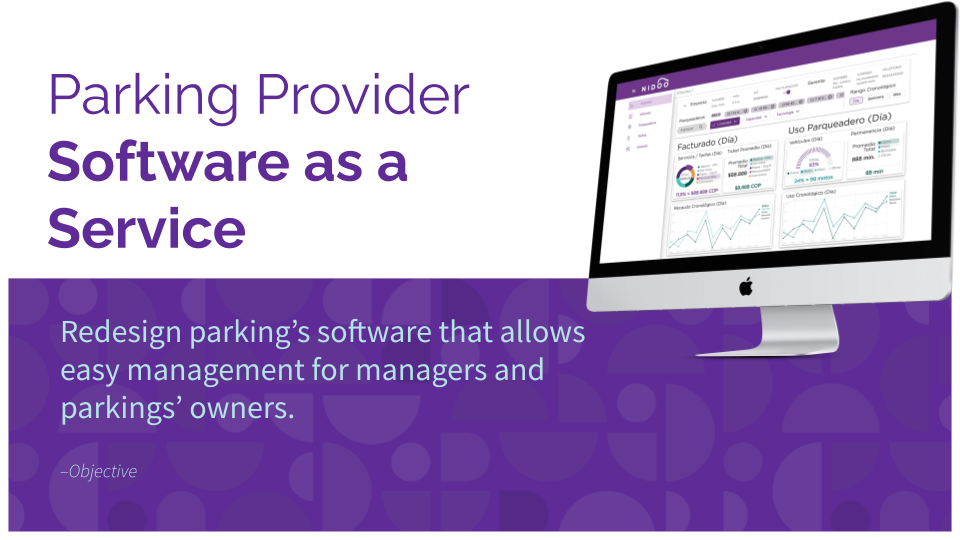
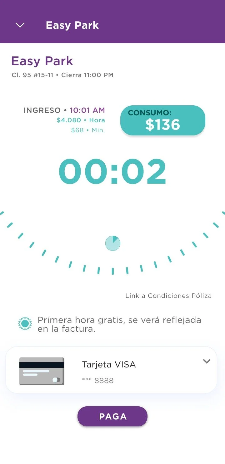
Nidoo Web SaaS • Parking Provider

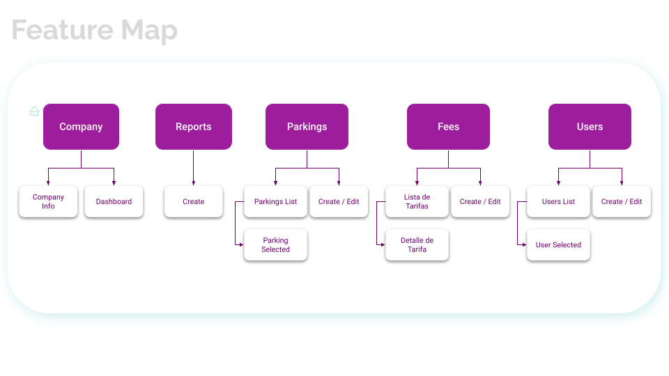
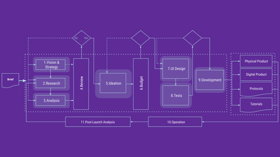
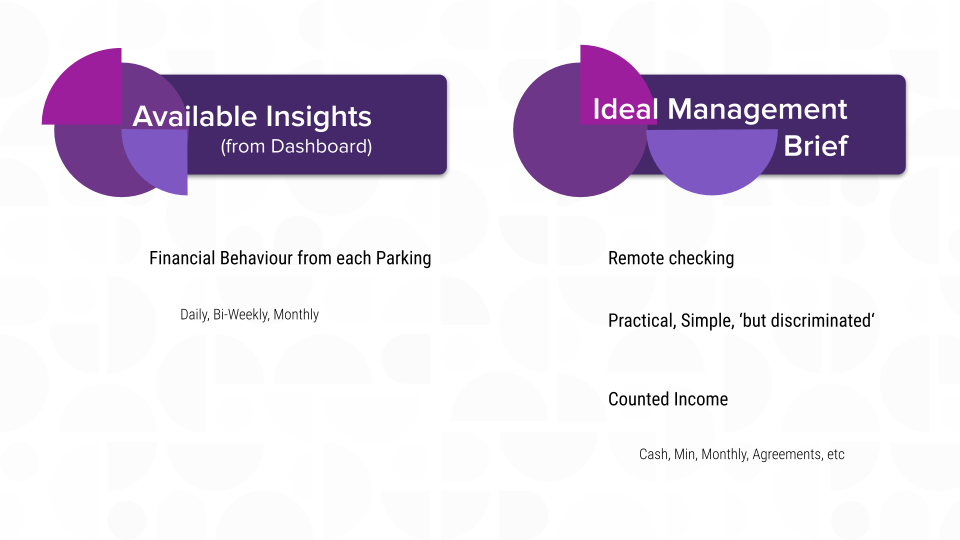
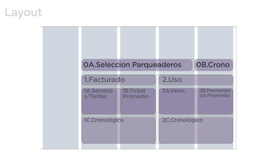
When leading the Product Design team (about 4) in this parking-ecosystem startup, I created, conducted and deliver everything from research to hand-off in this case. Initially the scope was to design the home-screen with a dashboard in mind, but I ended up redesigning the entire platform.

Deliverables: Interviews Analysis, Feature Map, Layout, Design Evaluation, UI Design

Methods: Stakeholder Interviews, Information Architecture, UI Design

Methodology: Design Sprint

Methods Addressed: Ask the Experts - Stakeholder Interviews, Learn through patterns, Map, Sketch, Prototype

Tools: G-Suite, InVision


Nidoo On Demand • Parking User

For this project, I led the Product Design team (about 4). The things I created involved, metrics plan and follow-up with dev and implementation, Research Plans, Analysis/ Mapping, Product Architecture (Site-Maps, User-Flows and Wireframes), User Tests, some of the UI (G-Map Skin, Micro-Interactions and Oboarding Lottie Animations)

Methodology: Design Thinking & Human Center Design

Methods: Stakeholder Workshop, Current & Future State Mappings, UX Metrics creation & implementation, Screening Plan, Research Plans, Design System, Micro-Interactions, G-Map Design, Motion Design, Cognitive Walkthroughs (User Tests for Validation), Stakeholder Interviews

Tools: G-Suite, InVision, Draw.io, Google Material Design, Adobe After Effects

Deliverables: UX North Star, UX Metrics, Screening & Research Plans, Research Analysis -Mappings (Current & Future) & Personas, Feature-Maps, User-Flows, Wireframes, Test Plans and Findings, Interview Plans

Nidoo_Mobile_OnDemand_V1 (2).png
 
 
Nidoo_Mobile_OnDemand_V1 (12).gif

Onboarding excerpt screens created with Adobe After Effects, Bodymovin & Lottie


Dondo Barter App

The entirety of this project was done by me. Through a Sprint-like methodology I took the brief given by the client, define a scope, identified assumptions, ideate through How Might We(s), chose a target and design hypothesis, establish success UX metrics from the proposed product, define Design Principles, mapped the Golden Path(s) for both platform roles, sketched and created the User-Flows. With Figma I created the wireframes displayed in this case. I also created a Research Plan for validating the design hypothesis based on the ‘Cognitive Walk-through’ -mediated method.

Brief


Debrief

Artboard 6.png
Artboard 7.png
 

Mapping

Artboard 9.png
Artboard 10.png
Artboard 11.png
Artboard 12.png
Artboard 13.png
Artboard 14.png
Artboard 15.png
Artboard 16.png
Artboard 17.png
Artboard 18.png
 

Sketching

Artboard 20.png
 

Userflows

Artboard 22.png
Artboard 23.png
 

Wireframes


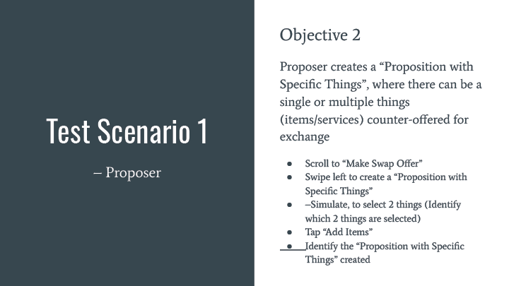
User Testing Plan

Cognitive Walkthroughs

Artboard 27.png
Artboard 28.png
Artboard 29.png
Artboard 30.png
Artboard 31.png
Artboard 32.png
 

App Consejero Financiero

I was solely involved in the deliverables presented in this project. The closest methodology I aligned with is Design Sprints, were I de-briefed the given requirement through the 4 Jobs To Be Done provided and redesigned a financial advisor app. There was an initial app-evaluation, domain research, design hypotheses, Golden Path, Product Information Architecture and Mid-Fidelity screen-designs. The Mid-fidelity wireframes were delivered through Figma and Google’s Material Design system.

Brief

Artboard 4.png

Debrief

Artboard 6.png

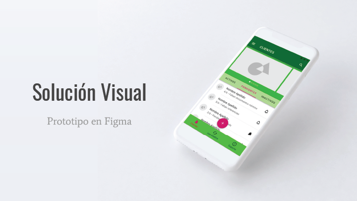
Entregable 1 — Solución Visual del Home

Entregable 2 — ¿Cómo se llegó a la solución visual?

Entregable 3 — Justificación del Proceso de Diseño

Diagnóstico Inicial – Evaluación de Principios Interactivos

Diagnóstico Inicial — Revisión Tecnológica

Hipótesis de UX

Mapeo

Arquitectura de Información

Ideation Tool from Cooper Hewitt Museum API

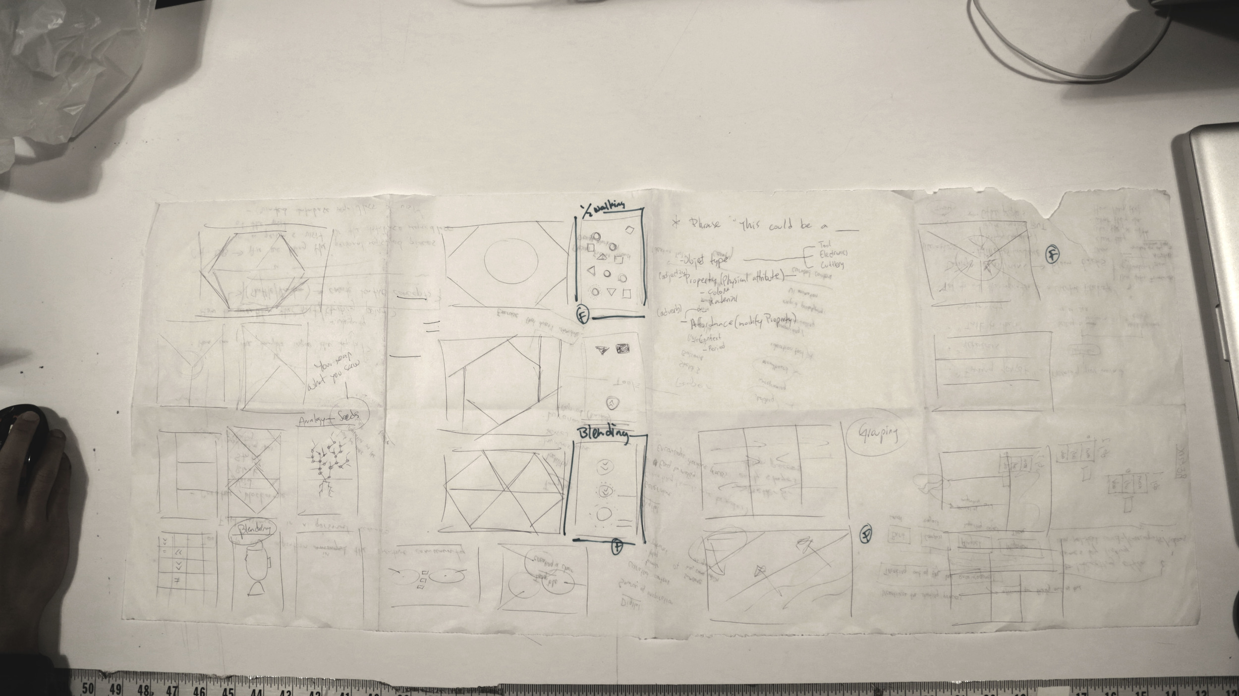
This project is an ongoing pursue around the question of how to overcome a creative block? Partnered with Lutfiadi Rahmanto, we started out scribbling, sketching and describing the problem to better understand what it meant for each of us and how do we scope this problem and usually respond to it.

UX Research

From the first session we were able to narrow the idea onto a determined goal: A tool to aid inspiration in the creative process. This led us to consider various things around the sought scenario and allowed us to start asking other creatives around this. We sought to better understand –qualitatively– how creatives describe a creative block and more importantly how is creative block overcome? From this session we were also able to reflect on how to aid that starting point of ideating, often a hard endeavor. A resonating answer in the end, was through linking non-related words, concepts or ideas.

We also researched two articles with subject matter experts about Creative Block and Overcoming It ("How to Break Through Your Creative Block: Strategies from 90 of Today's Most Exciting Creators" and "Advice from Artists on Hot to Overcome Creative Block, Handle Criticism, and Nurture Your Sense of Self-Worth"). Here we found a collage between our initial hypothesis with additional components such as remix, from Jessica Hagy's wonderful analogical method of overcoming her creative block by randomly grabbing a book and opening it a random page and linking "the seed of a thousand stories". Another valuable insight was creating space of diverted focus from the task at hand generating the block. We also found a clear experience-design directive for our app, to balance between constrain –structured scrambled data from the API– and freedom –imaginative play–.

Brief, Personas and Scenarios

After validating our intuitive hypotheses on how to address the problem through the contextual inquiries and online articles we came up with a solid Design Brief:

Encourage  a diverted focus where people are able to create ideas by scrambling data from the Cooper Hewitt's database into random ideas (phrases). 

Through this research we created seven different behavior patterns and mapped them onto this two-axis map, that defines the extent to which personas would behave between casual/serious and unique/remix

For a more detailed description of these archetype behaviors visit this link

This enabled us to create our guiding design path through what Lola Bates-Campbell describes as the MUSE. An outlier persona to direct and answer the usual nuances behind designing, in this case, our mobile application tool to aid Mae Cherson in her creative block. We determined her goals and thus her underlying motivations, what she usually does –activities– during her creative environment and how she goes around between small and greater creative blocks in her working space. We also describe her attitudes towards this blocking scenario and how her feelings entangle whenever seeking for inspiration. There were some other traits  determined as well that can be reach in more detail through this link.  Overall we crafted this Muse as a reference point for creating an inspirational experience for the selected archetypes –The Clumsy Reliever and The Medley Maker–.
Engagement

Parallel to the archetypes mapping, we began thinking how to engage our audience –Artists, Designers, Writers, Thinkers, Makers, Tinkerers, all poiesis casters–. Soon we realize the opportunity of captivating our audience through a game-like interaction. A gameplay that requires simple gestures and encourages discoverability. Some of the games we took as reference are Candy Crush and 2 Dots. Two simple games that have out-stand for their heavily and widespread engagement.

Wireframe Sketches

By having research cues and possible game-like affordances in mind there's proliferous space to weave tentative design solutions. Hence we made a couple whiles to sketch layouts, concepts, poetic interactions and nonsense infractions.

On the other side we created sense and sought a balance between amusement and feasibility. At the end of this session we came up with three Design Layout Concepts and general Affordances (call to interaction): Linking, Discovering and Dragging.

Test Insight

From these concepts we started making interactive prototypes. While creating the Discovering prototype, we realize people's intuitive mental model beneath a Candy Crush-like interaction did not match with our design intent, and trying to match it resulted overly complicated and forced. This is why we created prototypes for the Linking and Dragging concepts.

Prototypes

Another prototype explores the underlying preference between text-driven inspiration and visually-driven inspiration. While testing these prototypes we realize some people tent to feel more inspired by imaging the words from a text, and other people feel more inspired by visual queues. This prototype allows both explorations.

The next step is to select one gameplay interaction from our user tests and sintactically address the text data from the API. 


This is another interaction mode –Remixing Mode–, thought after Katherine's valuable feedback on our final prototype that can be accessed in this link.

Unisabana App

By mid 2014, along with Jenny Robayo and a team of students, we launched the official mobile application for Universidad De La Sabana. It was a creation process that involved a Human Centered Design approach and a semester of hard work. I was the Product Designer behind it, from UX Research to UI Development, good old generalist.

Methodology: Human Center Design

Methods: Focus Groups, Interviews, Stakeholder Prioritization, Design Principles, Personas, Wireframes, Mockups & Prototypes

Tools: Adobe Illustrator, Keynote, G-Suite

Deliverables: Research Analysis, Information Architecture, Screen Designs and Assets

From left to right, Rafael Rodriguez (Integration Lead), Ricardo Sotaquira (Information Technology Engineering Director and Project's Director), Francisco Ramirez (Design Lead), Jenny Robayo (Development Lead), Juan Pablo Velasquez (Student), Alejandro Zambrano (Student). Two students missing: David Piñeros and Nicolas Guzman

Even though this project involved NDAs, the overall process began with the core team (Director and Leads) drafting the Project's Proposal and Design Concept. After an agreed Brief with the stakeholders, we conducted User Research to validate our initial hypotheses and discover new opportunities. 

The video at the left is an excerpt from the User Research activities I conducted. They were held in the first Design phase, hearing our main audience, the student community.

Out of this research we crafted Design Principles that would guide us in the App's UX and UI. We also created personas that aided the scenarios.

By overlapping Needs from users and Desires from stakeholders, and the development team's Abilities we decided which features approach first. Once having everyone on the same page, I created tentative layouts through Wireframes and Mockups, that I translated later into tap-through prototypes.

We delivered a Mobile App with a set of features with breakthrough feature to encourage students to improve their performance (virtual academic advisor) and the campus community's daily activities (news, menu, events). The advisor is a tool that will suggest what should a student aim for his next graded assignment (exams, projects, homework) according to a desired course-grade.

This is a run through the different services, natively developed in iOS and Android available for download in their corresponding links