ReSounding the City

This is a performance made thanks to the Graduate Student Organization (GSO) Grant at NYU's Tisch School of the Arts. In collaboration with Daniela Tenhamm-Tejos, Jana L. Pickart and Ansh Pattel we explored body language and psycho-geography in urban spaces. I was the developer behind the Gesture Recognition code. For the official website please visit this link.

With this project I created a series of visual effects that responded to the performer's choreography and the poet's voice and audience interaction. These effects were created in the C++ toolkit known as OpenFrameworks. Here is a sneak-peak of these effects

Performer and Tech Tryout

All Developed Effects

Ideation Tool from Cooper Hewitt Museum API

This project is an ongoing pursue around the question of how to overcome a creative block? Partnered with Lutfiadi Rahmanto, we started out scribbling, sketching and describing the problem to better understand what it meant for each of us and how do we scope this problem and usually respond to it.

UX Research

From the first session we were able to narrow the idea onto a determined goal: A tool to aid inspiration in the creative process. This led us to consider various things around the sought scenario and allowed us to start asking other creatives around this. We sought to better understand –qualitatively– how creatives describe a creative block and more importantly how is creative block overcome? From this session we were also able to reflect on how to aid that starting point of ideating, often a hard endeavor. A resonating answer in the end, was through linking non-related words, concepts or ideas.

We also researched two articles with subject matter experts about Creative Block and Overcoming It ("How to Break Through Your Creative Block: Strategies from 90 of Today's Most Exciting Creators" and "Advice from Artists on Hot to Overcome Creative Block, Handle Criticism, and Nurture Your Sense of Self-Worth"). Here we found a collage between our initial hypothesis with additional components such as remix, from Jessica Hagy's wonderful analogical method of overcoming her creative block by randomly grabbing a book and opening it a random page and linking "the seed of a thousand stories". Another valuable insight was creating space of diverted focus from the task at hand generating the block. We also found a clear experience-design directive for our app, to balance between constrain –structured scrambled data from the API– and freedom –imaginative play–.

Brief, Personas and Scenarios

After validating our intuitive hypotheses on how to address the problem through the contextual inquiries and online articles we came up with a solid Design Brief:

Encourage  a diverted focus where people are able to create ideas by scrambling data from the Cooper Hewitt's database into random ideas (phrases). 

Through this research we created seven different behavior patterns and mapped them onto this two-axis map, that defines the extent to which personas would behave between casual/serious and unique/remix

For a more detailed description of these archetype behaviors visit this link

This enabled us to create our guiding design path through what Lola Bates-Campbell describes as the MUSE. An outlier persona to direct and answer the usual nuances behind designing, in this case, our mobile application tool to aid Mae Cherson in her creative block. We determined her goals and thus her underlying motivations, what she usually does –activities– during her creative environment and how she goes around between small and greater creative blocks in her working space. We also describe her attitudes towards this blocking scenario and how her feelings entangle whenever seeking for inspiration. There were some other traits  determined as well that can be reach in more detail through this link.  Overall we crafted this Muse as a reference point for creating an inspirational experience for the selected archetypes –The Clumsy Reliever and The Medley Maker–.

Engagement

Parallel to the archetypes mapping, we began thinking how to engage our audience –Artists, Designers, Writers, Thinkers, Makers, Tinkerers, all poiesis casters–. Soon we realize the opportunity of captivating our audience through a game-like interaction. A gameplay that requires simple gestures and encourages discoverability. Some of the games we took as reference are Candy Crush and 2 Dots. Two simple games that have out-stand for their heavily and widespread engagement.

Wireframe Sketches

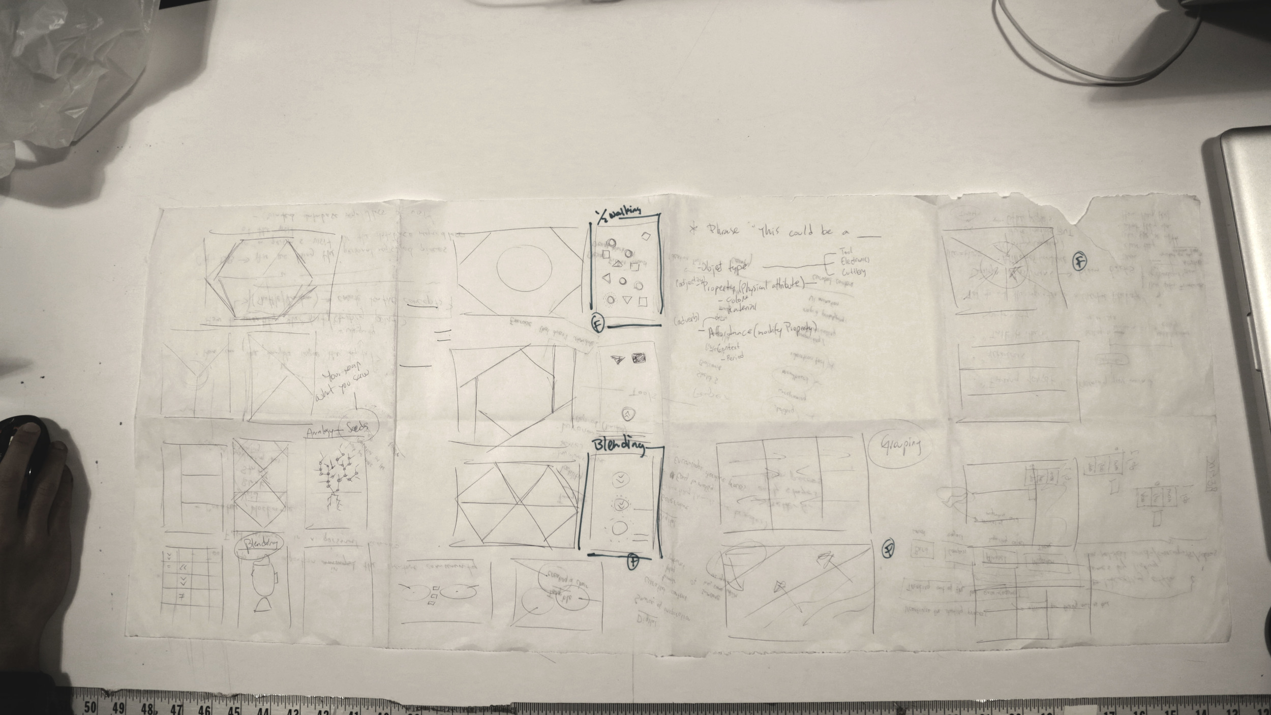
By having research cues and possible game-like affordances in mind there's proliferous space to weave tentative design solutions. Hence we made a couple whiles to sketch layouts, concepts, poetic interactions and nonsense infractions.

On the other side we created sense and sought a balance between amusement and feasibility. At the end of this session we came up with three Design Layout Concepts and general Affordances (call to interaction): Linking, Discovering and Dragging.

Test Insight

From these concepts we started making interactive prototypes. While creating the Discovering prototype, we realize people's intuitive mental model beneath a Candy Crush-like interaction did not match with our design intent, and trying to match it resulted overly complicated and forced. This is why we created prototypes for the Linking and Dragging concepts.

Prototypes

Another prototype explores the underlying preference between text-driven inspiration and visually-driven inspiration. While testing these prototypes we realize some people tent to feel more inspired by imaging the words from a text, and other people feel more inspired by visual queues. This prototype allows both explorations.

The next step is to select one gameplay interaction from our user tests and sintactically address the text data from the API. 


This is another interaction mode –Remixing Mode–, thought after Katherine's valuable feedback on our final prototype that can be accessed in this link.

Mind the Needle — Popping Balloons with Your Mind 0.2


Concept

Time's running out! Will your Concentration drive the Needle fast enough? Through the EEG consumer electronic Mindwave, visualize how your concentration level drives the speed of the Needle's arm and pops the balloon, maybe!

Second UI Exploration

Second UI Exploration

Development & UI

I designedcoded and fabricated the entire experience as an excuse to explore how people approach interfaces for the first time and imagine how things could or should be used.

The current UI focuses on the experience's challenge: 5 seconds to pop the balloon. The previous UI focused more on visually communicating the concentration signal (from now on called ATTENTION SIGNAL)

This is why there's prominence on the timer's dimension, location and color. The timer is bigger than the Attention signal and The Needle's digital representation. In addition this is why the timer is positioned at the left so people will read it first. Even though Attention signal is visually represented the concurrent question that emerged in NYC Media Lab's "The Future of Interfaces" and ITP's "Winter Show" was: what should I think of? 

Showcase

Insights

What drives the needle is the intensity of the concentration or overall electrical brain activity, which can be achieved through different ways, such as solving basic math problems for example –a recurrent successful on-site exercise–. More importantly, this question might be pointing to an underlying lack of feedback from the physical devise itself, a more revealing question would be: How could feedback in  BCIs be better? Another reflection upon this interactive experience was, what would happen if this playful challenge was addressed differently by moving The Needle only when exceeding a certain Attention threshold?

Previous Iterations

Palindrome Hour Web-Clock

This is a project that celebrates hours that can be read either from left-to-right and right-to-left, same as palindrome text –flee to me, remote elf–. A concept of living symmetry overlaid with pleasing coincidence, and chunks of daily serendipity. 

 I designed & coded this project in Javascript with the creative toolkit p5.js. Hop in, and catch the palindrome hours! Link To Project Here

Previous Iteration

UI Drafts

Translated Code –Processing to OF–

This is a book on Generative Design, and the examples I've selected are oriented towards data visualization. The main limitation with the overall pursue is the underlying library –Generative Design– which doesn't exists in OF yet.

The Processing example used libraries that can be found in OF's addons, which draws the attention to the limitations of pursuing an entire translation of the examples. There's other examples that use theGeomerative example and the Generative Design library that are only available to Processing –or Java based IDEs–. Anyhow, this particular example used a PDF converter and Calendar libraries to export the application's canvas onto images with a timestamp. In the failed attempt I was able to include a calendar addon that didn't end up using in the working one. 

Even though there's a Project Generator that will include whichever addon needed, it doesn't work every time. Since this was one of those times, I ended creating the failed attempt in the same folder of the ofxICalendar addon. To try and  solve one of the primitive drawing elements I sought another addon called ofxVectorGraphics, that couldn't ever got it working on an already created project.

There are primitive functions in OF similar to Processing's, the arc however is not one of them. Instead, there's two ways to go around this. The addon mentioned before, and using an object called ofPath that contains the function arc. After a lot of trial and error I was able to finally get an arc drawn in an isolated project. As any OF project, you have to create the variables and objects in the *.h file and then you can work with them in the *.cpp file. What I came to know, after figuring out the specifics of not filling, outlining, setting the resolution and not closing –to an extent– arcs was, invoking the function needed to actually draw the function. This particularly was completely counter intuitive from the previous programming experience.

After Kyle McDonald's workshop in introduction to OF I learned that the project could be simplified significantly to one *.cpp file. This meant however that I wouldn't  be able to include the feature of exporting an image with a timestamp. Currently this is the working translated project. I would also like to thank AV –Sehyun Kim– for helping me out on how to –again– draw the arcs.

Generative Gesltaltung OF Translation

Taking some Processing code examples from this book, and translate them into OpenFrameworks. The project is directed to anyone interested in learning OF who has previous knowledge in Processing. Not only is there Generative Design involved, but Data Visualization and a new programming language/framework.

This is a book on Generative Design, and the examples I've selected are oriented towards data visualization. The main limitation with the overall pursue is the underlying library –Generative Design– which doesn't exists in OF yet.

UI Draft #2 BCI & Processing

This is the Interactive Wireframe so far, for my BCI Interactive Installation. Basically I'm trying ways to better communicate what's going on when using the Mindwave, and how can we translate its signal into a more structured task. The code for this UI Wireframe can be found in this Github Repo.

Morse Code Translator

Inspired by the "Hi Juno" project, I sought an easier way to use Morse Code. This is why I've created the Morse Code Translator, a program that translates your text input into "morsed" physical pulses. One idea to explore further could be thinking how would words express physically perceivable (sound, light, taste?, color?, Tº)

So far I've successfully made the serial communication and the Arduino's functionality. In other words, the idea works up to Arduino's embedded LED (pin 13). This is how a HI looks being translated into light.


Followup, making the solenoid work through morse coded pulses. You can find the Processing and Arduino code in this Github Repo.


NUI BCI Study #1 "Mindwave"


Through this first exploration of interfacing Neurosky's Mindwave I've learned a couple things around EEG and Processing. The current library I'm working with is called Thinkgear, which allows to read different signals (low and high values for alpha, beta and gamma, and delta and theta signals, plus a blinking signal). Besides the annoying bluetooth pairing, this consumer interface is still in the making and Processing's latency doesn't make it easier for user feedback. I'm sure there's better ways of interfacing this to optimize user feedback –other software–, and there should be better consumer EEG devices out there. Nonetheless it has been a thrilling experience to better understand the sine and cosine functions, arrays and libraries. Here's my second draft I've crafted with this curious Natural Brain Computer Interface. The code for this UI Draft can be found in this Github Repo.

UI Draft #1

With the opensource JAVA toolkit Processing, I started exploring around User Interfaces, Time representation and Hover Timing. Hover Timing, might bring intersting possibilities for Natural User Interface such as the Kinect or Leap Motion, where different affordances come into place wtih simple tasks like selecting an element. The code for this draft can be found in this Github Repo

Elements

"Perfection is achieved not when there is nothing left to add, but when there is nothing left to take away" Antoine de Saint-Exupéry

"Adding the meaningful and subtracting the obvious" John Maeda

Not long ago I stumble across an article called 7 Design Principles, Inspired By Zen Wisdom. In it, they describe the state mastered through composing with these principles as Shibumi and even though it has no direct translation they explain that its meaning "is reserved for objects and experiences that exhibit in paradox and all at once the very best of everything and nothing: Elegant simplicity. Effortless effectiveness. Understated excellence. Beautiful imperfection." This is the beginning for my pursue towards Shibumi Interactive Experience.

This is why, through the homework's brief I began composing by the first two principles, Austerity and Simplicity. This is why when deciding how to compose the portrait, I wonder what are the least necessary elements to perceive a face. Later on, I looked onto adding depth and that's how the overall size composition and hands came about.

Another trait I explored all through the exercise, was to craft the composition through dynamic dimensions. In other words, how this composition have consistent dimensions, regardless of the device it's being used in. In the end, I noticed whenever you're trying to figure out a coordinate in space, it's more effective –as code-crafting– to modify ratios through floating numbers than by arithmetic operands. This is why, everything is created with width and height variables.

I've also started trying another environment for editing code called Sublime Text 2. I find the auto-suggested functions whenever a character is typed appealing, but what has really stand out from the conventional environment is the function parameters auto-filling.

Electronic Vote

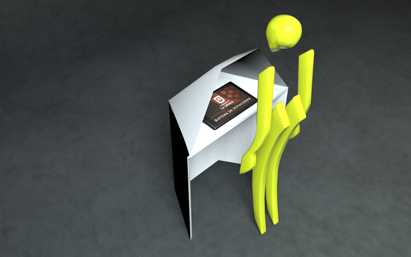
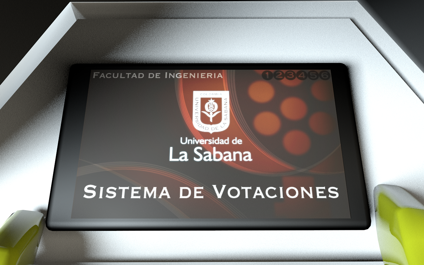
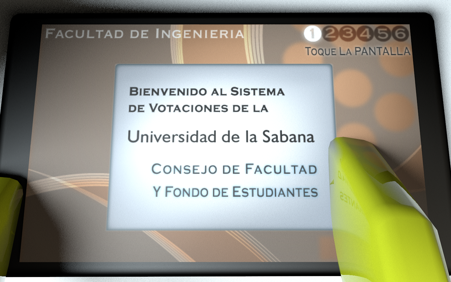
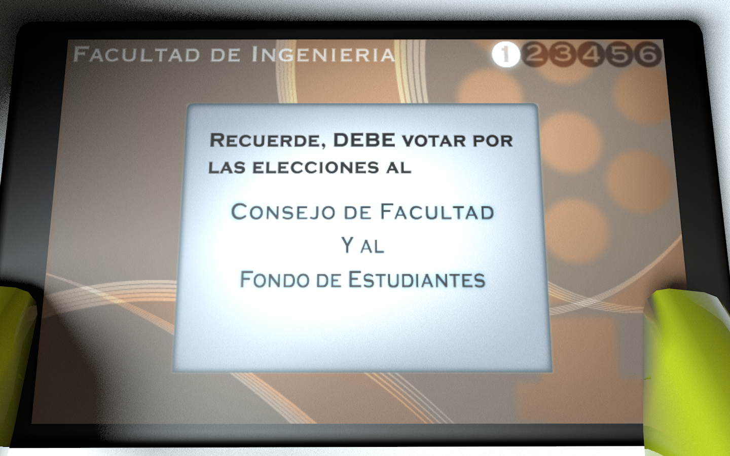
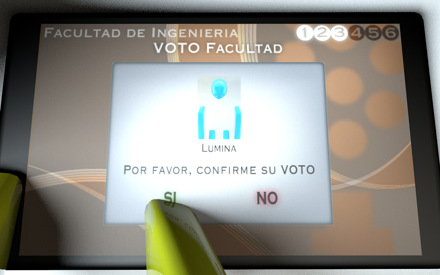
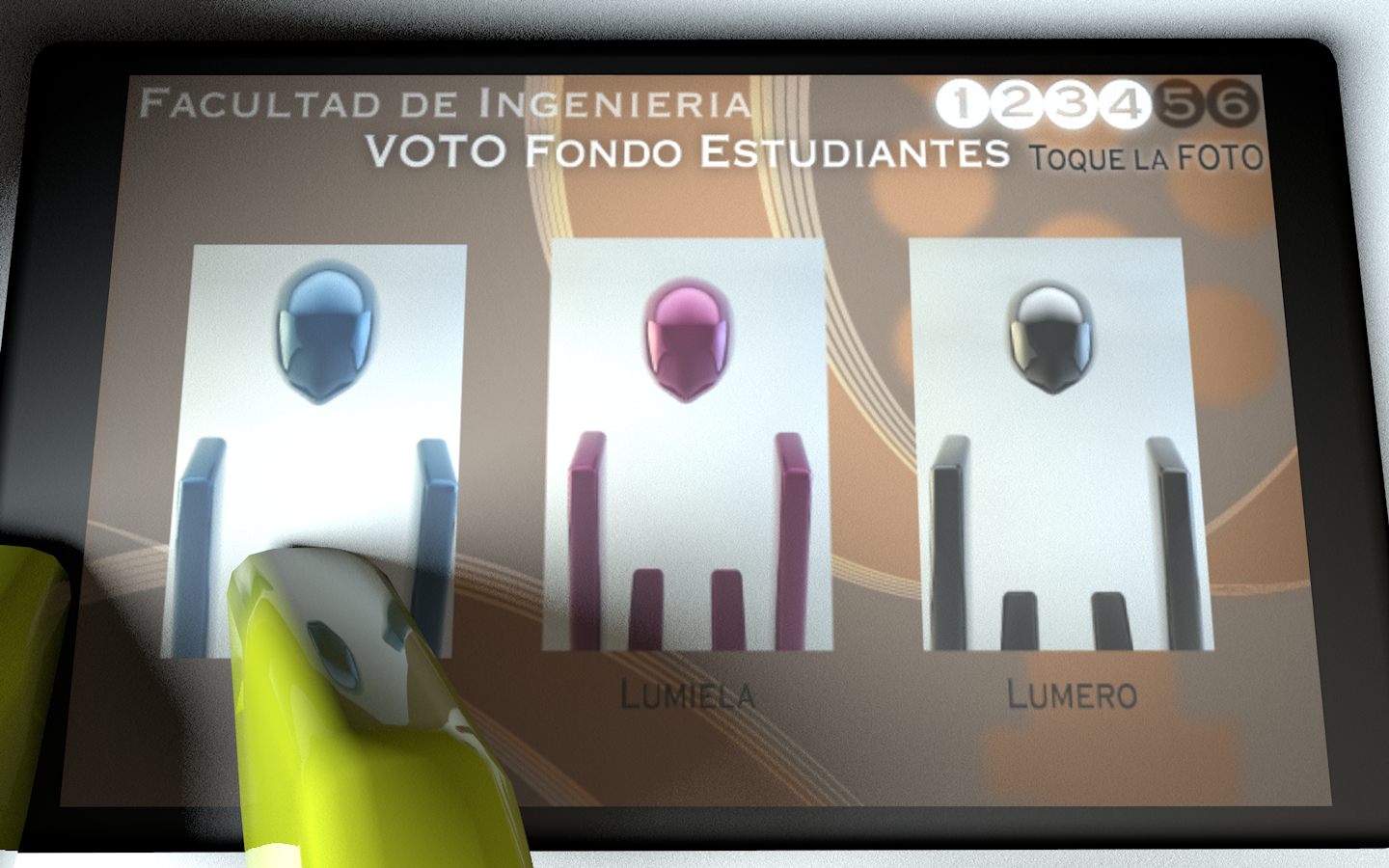
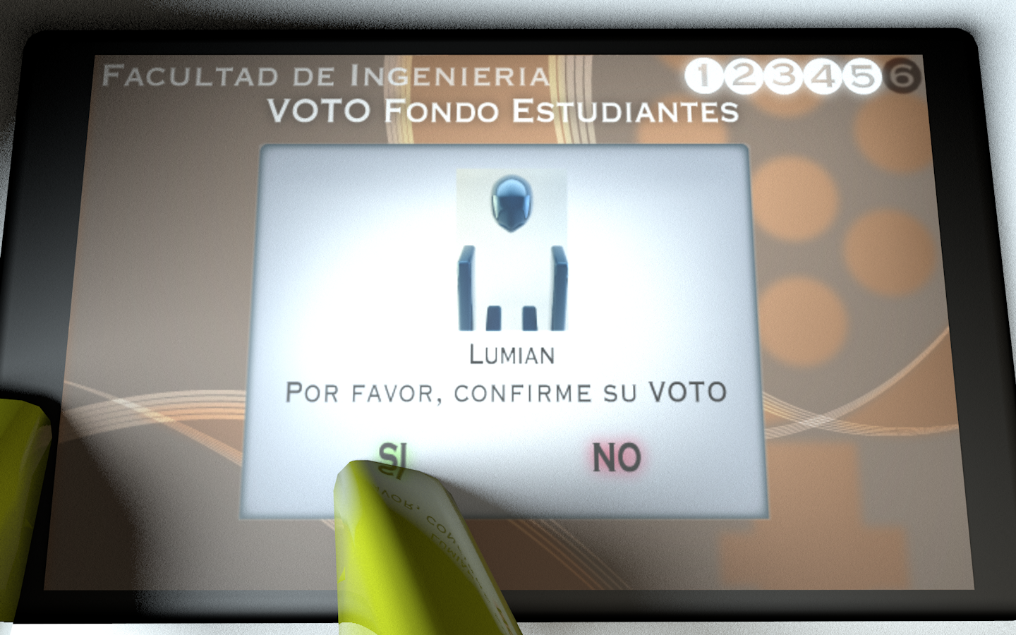
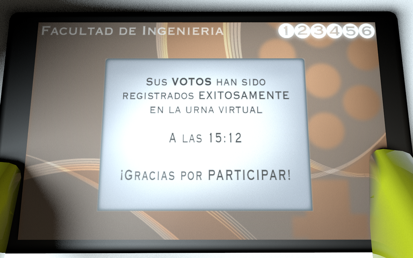
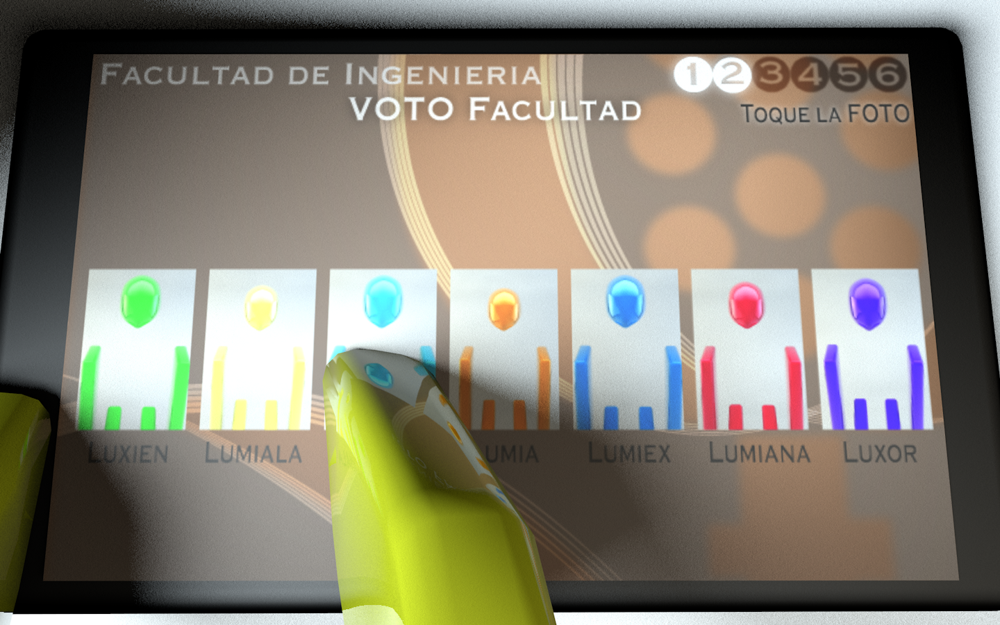
In 2013 we created an electronic vote system through Android tablets that were remotely activated by a Laptop. I was the UI/UX Designer and Industrial Designer –Cubicle. Our main Design Challenge was to create an election system easily perceivable and predictable –intuitive– enough so grown-ups with no previous experience with mobile devices could vote. It was a successful system that didn't got in the way, with 93% of participation.
Storyboard

I created this storyboard so stakeholders could better understand the sought experience.

Scrutiny's visualization

For the scrutiny I developed this visualization in Processing