Tangible Retail Display
Images taken from their Blog Post
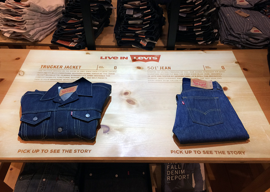
After a lot of searching and looking around, I stumble upon a company that creates interactive products for commercial scenarios beyond tactile interfaces onto tangible ones. The interactive product is triggered by lifting one of the products sold in the store, to expose an album of first-person stories around diverse brand’s products. Even though it sets an innovative consumer experience, after half an hour of waiting for someone to comply, I finally decided to take it for a spin. The product is a sealed black box, with what I imagine is a projector, a computer and a camera. The main idea behind it is to transform any surface into an interactive tangible user interface. Basically this is a usable interactive experience with catchy stories behind a tracking framework.
The fact this product is interfacing with real tangible artifacts does set an entire realm of possibilities, even though it was only used for triggering a strictly tactile command interface. This tactile-2D-interface had the proper affordances to easily manipulate the experience. Its results could easily be noticed when navigating and selecting different features, and because it was built on top of the tactile interface paradigm, it was really easy to learn how to use it. However, it lacked the first principle of interaction design, it wasn’t perceivable as an interactive display at first sight. Not really sure why, but its call to action –or its lack of– left clients adrift. Even still when the product had a blinking text prompt of 1/10 of the display’s height –more less– for inviting people to interact –"Please lift to read the stories"–, the overall idea of how to start the interactive experience wasn’t overly persuasive. Maybe, given to the fact that it resembled a light-display-installation that you’re not supposed to touch kind-of imaginary scenario, but not 100% certain. Overall the 5 minute experience was entertaining.
The hypothesis I had before approaching the product was that this interface should aim for what Norman calls affective approach, considering the context and goal are for retail purposes, it is not a scenario that requires a serious concentrated effort reach its goal. In these order of ideas, the product balances beauty and usability fairly well, where easy-going use and contemplation are conveyed.


