Retirement Plans Bank Feature
Tools: G-Slides, G-MD Color Tool, Figma
Deliverables: UX Research & Analysis, Information Architecture, Wireframes, UI Design & Prototype
Methods: Challenge, User Research -Online, Competitive Research & Analysis, Design Hypothesis, Information Architecture (Tasks, User-Flow), Wireframes, UI Design.
First screen from the Figma Prototype
Debrief
For a successful job opportunity test, I was asked to visually communicate the dramatic outcomes that can result from slight changes in BPS (Basis Points) –retirement plans, in an attractive intuitive and immediate way. This is what I came up within the 48 hour timespan. If you want to skip to the Figma Prototype.
Objective
Create a product that easily communicates the vast difference in results when there are slight changes in BPS for retirement plans.
UX Strategy
Stakeholder’s Desire
Our app should convey immediateness, attractiveness and intuitiveness .
UX Design Hypothesis
Communicate how these dramatic outcomes translate into their lives.
Key Question: What do people care about/value when choosing retirement plans?
Investopedia
“One of the most challenging aspects of creating a comprehensive retirement plan is striking a balance between realistic return expectations and a desired standard of living. The best solution is to focus on creating a flexible portfolio that can be updated regularly to reflect changing market conditions and retirement objectives.”
3 Things Most Americans Want In Retirement And How To Get Them, Forbes
“First, people want to experience freedom from financial worries in retirement. This should not come as a surprise as 95 percent of respondents stated that freedom from financial concern is important to their definition of success in retirement.[...]
Second, Americans want flexibility in retirement. Almost all respondents, 96 percent, stated that having the flexibility to do what they want in retirement is an important component to their definition of a successful retirement.[...]
Third, retirees want to spend time with family, to relax and travel as part of a secure retirement. For instance, 93 percent of the survey respondents stated that spending time with family was important for a successful retirement, 92 percent stated that relaxing was an important factor, and 80 percent stated that having the time to travel was crucial to a successful retirement plan.”
Competitive Research (Click here for more)
“The Best Retirement-Planning Apps” by Kate Anania, Investopedia, Dec./19
Findings
“Acorns” ‘Potential’ interactive simulation visually communicates simplicity, intuitiveness, attractiveness and potential impact in real-time
With a vertical slidable graph selector, people can determine the time at which the simulation sets the ‘Hypothetical Projection’ in terms of the user’s age
You can set another ‘Hypothetical Projection’ by selecting the “Change Your Potential” Button at the bottom
Another graph emerges and results are shown comparatively, ‘Recurrent Periodic Investment’ and ‘Current’
People can choose an amount of set money values (intervals of $5 & $10) and the periodicity of such amount (Day, Week, Month)
CTA "Turn on" button to activate “Recurrent Investment” feature, becomes very persuasive as you can perceive in real-time the vast difference from a small change
“Mint” harnesses integrations with financial products and presents them in a way that is useful and insightful from a daily and planning perspective
Simple UI with readable dashboards to have both a general understanding and details around spending and financial goals
Extensive “Budgeting” categories 19 (75 subcategories)
“Retirement Planner” Straightforward app with informative fields to have in mind
Ranked #1 in Investopedia, despite its poor Intuitiveness, Feedback and Visual Impact
Data Interpretation –from provided graph
Visually the difference between the 3 BPS outcomes are not perceived as “dramatically different”
Within an interactive environment such as mobile app, there's an opportunity where Data could be splitted, hidden and zoomed
Setting “Demographic Assumptions” with defaulted values and embed them in an interactive component like a “collapsible list”
“Scenario Assumptions” are the core of the simulation, so the three BPS buttons should always be visible
“Impact BPS Increase” give a general sense that withdrawal extends over time, but lacks meaningful possibilities for spending in hypothetical scenarios
Why are “Annual Withdrawal Amount”(s) and “Withdrawal %” the same regardless of BPS?
Assumption: The annual withdrawal amount is extended over more years
What if people would rather spend more over less years?
What kind of expenses are relevant (amounts and timespan)?
Are the years before retiring relevant when deciding a Retirement Plan?
Assumption: Since its a static data representation, it can’t change view
What if a closer “Retirement View” was presented?
Vital Info
Account Balance at Retirement Age
Annual Withdrawal Amount
Other info can be shown when selecting corresponding item
Information Architecture
What is(are) the necessary feature(s) to accomplish the objective?
Interactively visualize the dramatic difference in outcomes that can result from slight changes in BPS.
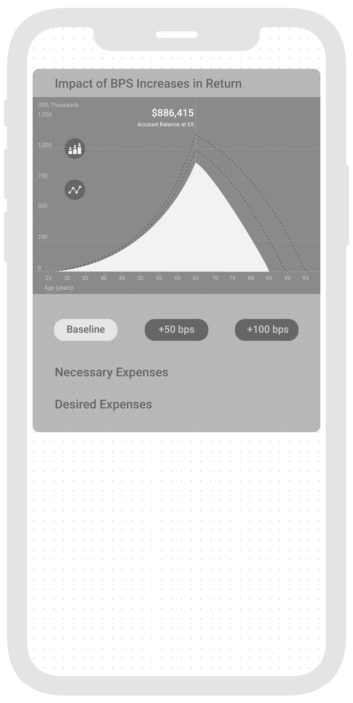
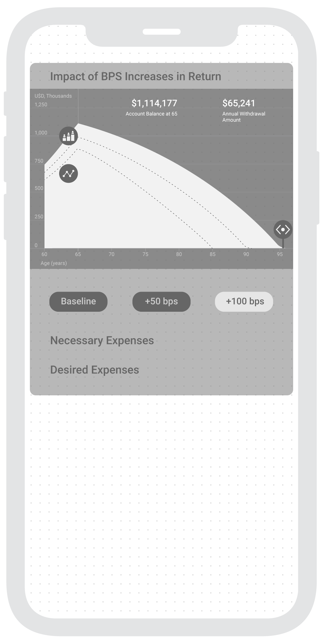
Create a more dramatic view in the graph by zooming the X-Axis of Age. This will translate visually into a greater difference.
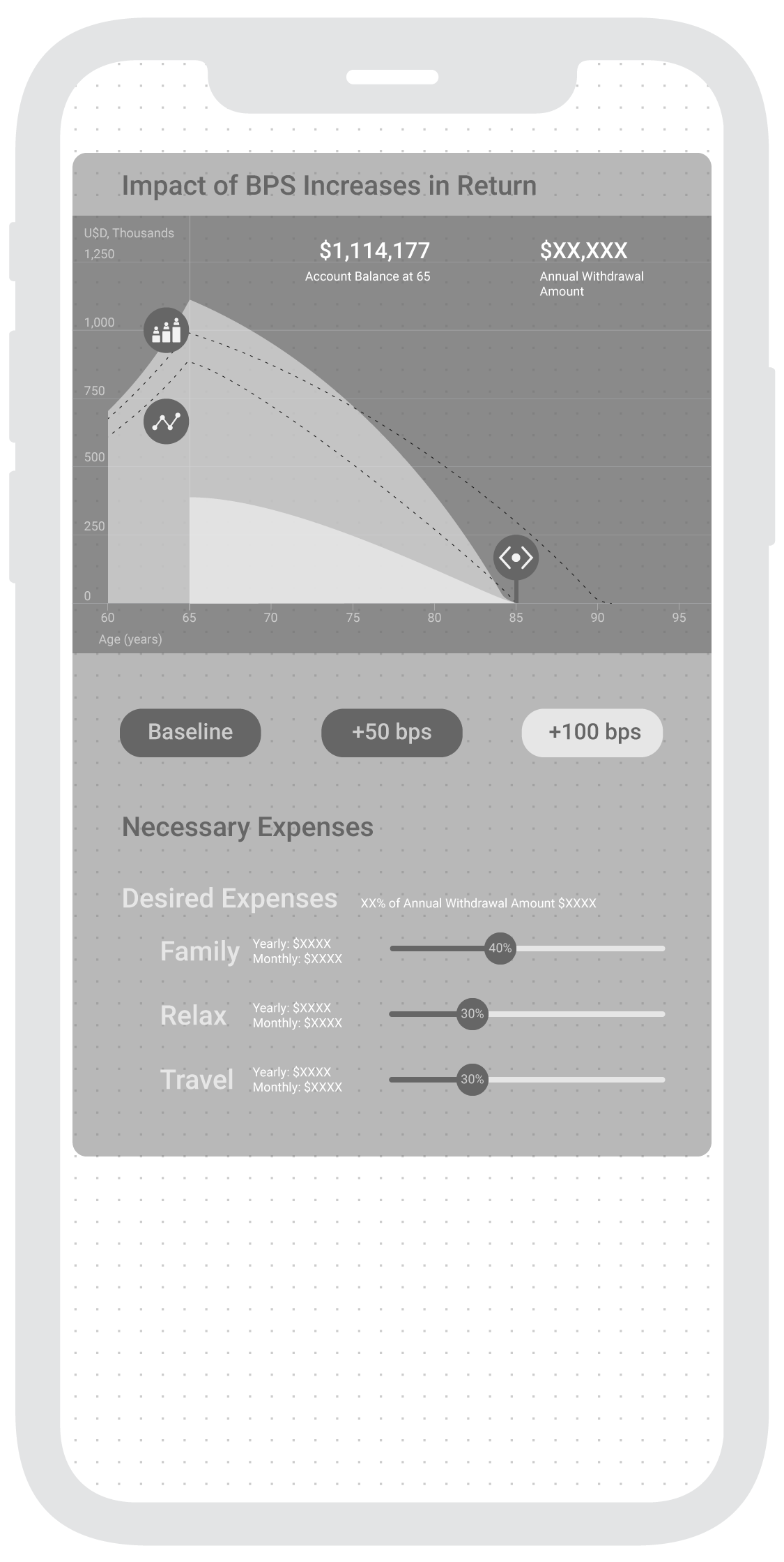
Similarly, communicating how could these changes translate into meaningful retirement scenarios such as more available spending on family visits per year or month.
Outline
3. Relevant Expenses Section Shown in BPS Increases Graph when selected
Necessary (Yearly, Monthly, Weekly) [Fixed and correspond to selected General BPS value of Age]
Food
Health
Home
Bills & Utilities
Transport
Taxes & Fees
Desired (Yearly, Monthly, Weekly) [Slidable in Age, X-Axis]
Family
Relax
Travel
Intro Screen (Demographic Assumptions)
Starting Balance: $0
Starting Age: 30
Starting Salary: $40,000
Retirement Age: 65
Impact of BPS Increases Graph
“Account Balance at Retirement Age 65” (Visible when selecting type of BPS, default “Baseline")
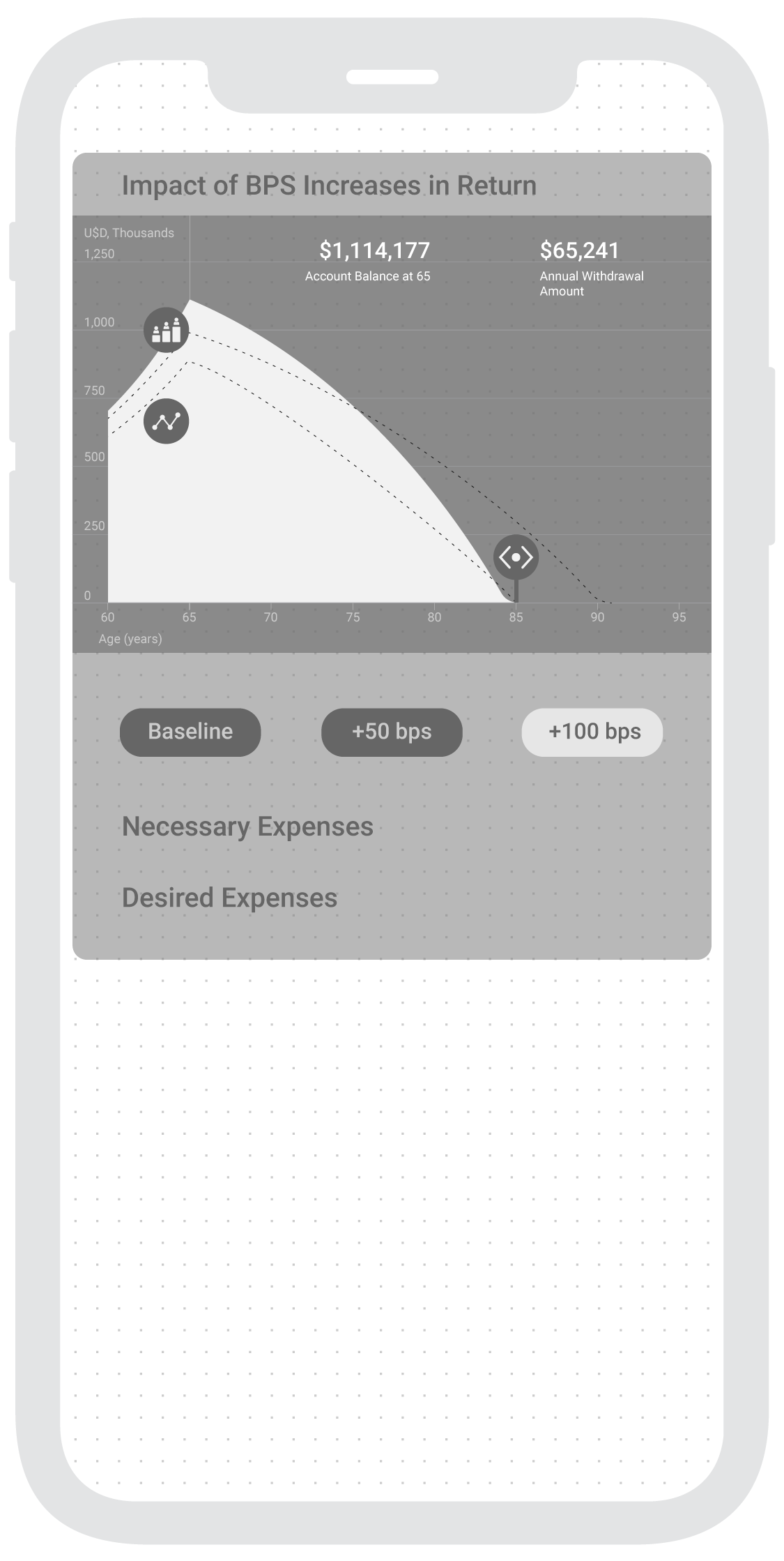
“Annual Withdrawal Amount” (Updates according to interactions)
Select BPS (Zoom to range from “Retirement Age” to “Life Expectancy”)
Account Balance at Retirement Age updates
Slide value -horizontal axis to choose a spending “Withdrawal Scenario Age” deadline in selected BPS (“Annual Withdrawal Amount” updates)
Wireframes
I have decided to take a mobile first approach, meaning the mobile app interaction will start from a phone layout since it is more widely used than tablets.
User Flow
Assumptions
I’ve decided to choose Mexico’s Bank “ABC Capital” since the American ABC Capital is a real estate company and the other ABC Capital is a Chinese Venture Capital whose website is in chinese.
Interface Design
I implemented Google’s Design Material since it presents a mobile OS agnostic approach for development.
Color
ABC Capital’s brand colors include Blue (#00457D) and Red (#E62C38).
Using Material Design’s Color Tool as the starting point for managing color alternatives.
Both primary colors showcase a vibrant result when they are combined (low readability). This is why, following some color theory, I have composed three alternatives around the blue spectrum, with the primary brand’s color and the two variants created with this tool.


